1. Introduction
In 1 February 2021, the military force in Myanmar launched a coup and arrested the civilian leaders, leaving the country in a dire state. The protests over the coup is one of the largest in Myanmar history, and the military have utilised water cannon, rubber bullets and live ammunition in the effort to stop the protesters (Cuddy 2021).
The country has long been led by a military junta, but a hope for democracy came when the military junta unexpectedly dissolved and appoints civilian ruler, President Then Sein. In 2015, Myanmar held an election, with Aung San Suu Kyi emerging as its de facto leader (Maizland 2021). Ms Suu Kyi is an ignitor for democracy in Myanmar, earning a Nobel Peace Prize while she was under house arrest in 1991 (Cuddy 2021). However, she lost much of her international support after her defence of the military who abuses Muslim Rohingya Minority, and led hundreds of thousands of them fleeing to Bangladesh in 2017 (News 2021).
Using the Armed Conflict Location & Event Data Project (ACLED) - a disaggregated data collection, analysis & crisis mapping platform that aims to bring clarity to crisis - we are going to examine the armed conflicts that occur in Myanmar during the course of 2015 to 2020.
2. Original Visualisation Evaluation
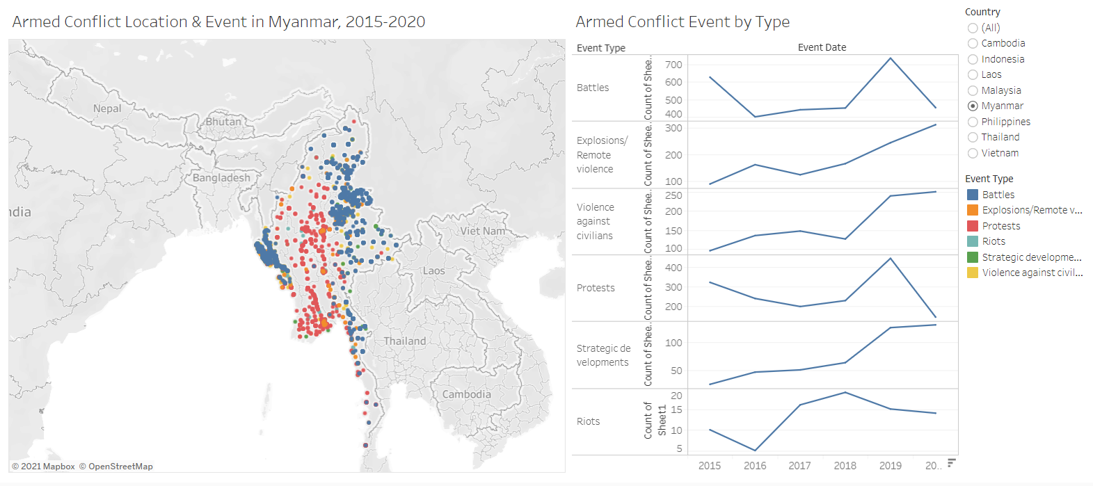
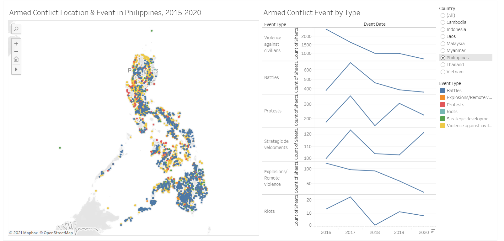
The original visualisation is the South East Asia Armed Conflict Analysis that is hosted in Tableau Public. It reveals the spatio-temporal patterns of armed conflict in selcted South East Asian countries between 2015 and 2020 by using a one-to-one dot-density map where each dot represent an actual event (“Dot Density Maps” 2020), with different colours used for each type of events.
The critiques are given in terms of clarity, aesthetics, and interactivity.
2.1 Clarity
To keep:
- The data is shown using map to show spatial patterns.
To improve:
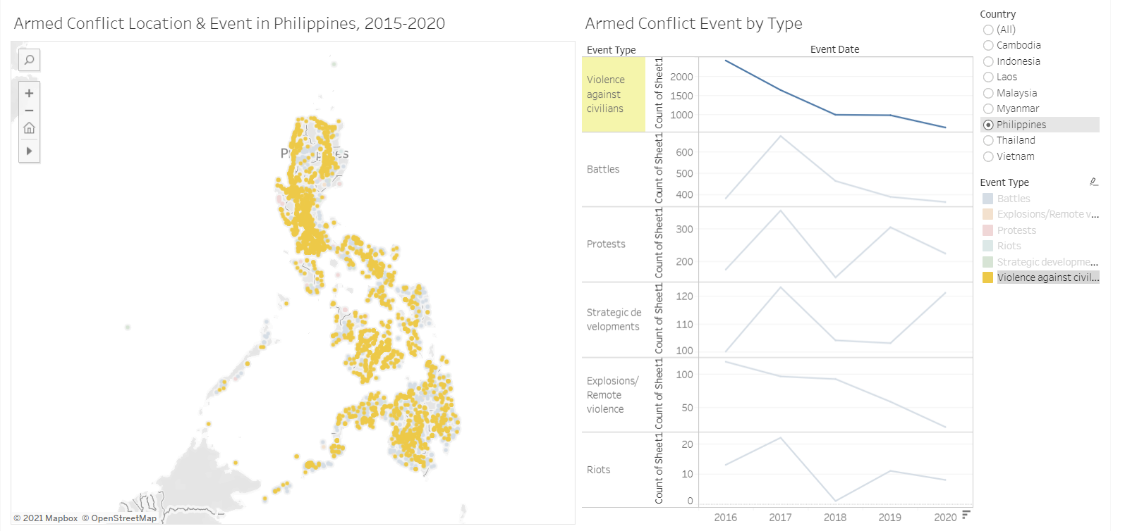
- Because the visualisation uses opaque circles, When the points overlap, we cannot see what is behind the top layer. This might obscure the density of data, or give the wrong impression that the value is lower some event types just because it is covered. If we only look at Figure 2, it does not seem that there are a lot of violence against civilian in the southern part of Philipines, but Figure 3 shows otherwise. We need to use lower opacity, show the event type one by one, or use other types that can show the values in the viz, such as proportional symbol map, choropleth, or heatmap.
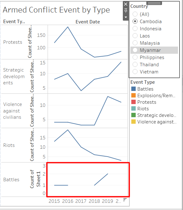
There is no way to see the distribution of events by year, even though a time series line chart exists.
The line chart that shows the time series of events is hard to compare because they are stacked vertically. Additionally, the axes are not standardized, so it does not have a fixed point of reference to compare the values.
The time series is not very accurate because if an event type does not occur in a particular year, the record is shown as null rather than zero. This breaks the line into several parts instead of showing a decrease in value.
- Placing the legend of the colors on the right most of the dashboard introduces an unnecessary mental clutter because the users need to look back and forth between the map and the legend, as well as having to memorize what does each color represents. The best practice is to remove legend if possible, and label the data directly (“Legends” 2021).
- The title is quite informative, but there is no useful lead-in.
- The y-axis for the line chart is shown as “Count of Sheet 1” which can cause confusion. A more descriptive label should be used instead.
- The legends for the colours are truncated.
2.2 Aesthetics
To keep:
- The use of fonts is consistent and easy to read.
- Terrain is not shown in the background map, so it looks cleaner and highlights the data being presented, which is the armed conflict locations.
- The colour of less important data are less prominent than the important ones, for example the axis ticks use grey colour.
To improve:
- Even when we filter to display only one country, only the data points are not shown but the background map for the other countries are still shown. This is rather distracting, and would be better if we only show the country of interest.
 2. There are a lot of different colours being used to represent the different types of events.The choice of colours is too reliant on hue variation instead of value or chroma, hence increasing the visual clutter (Stone 2006). It is better to limit the colour palette to 2 or 3 hues and use variation of colour intensity to make the visualisation more aesthetically pleasing and functional.
2.3 Interactivity
To keep:
- Dynamic title is used that will change according to the selected filter.
- The event type is used as a highlighter that connects to all visualisation on the dashboard. Both the line chart and the point pattern map will highlight the selected event type.
To improve:
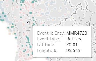
- The information shown in the tooltip is not informative. The users are unlikely to be interested with the Event ID, latitude, and longitude. The name of the location, the date or description of event might be more relevant.
- The transition between choosing different country filter is a little bit choppy. We can use animation to make it more smooth.
3. Alternative Graphical Representation
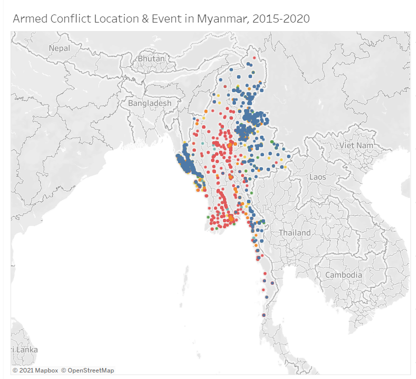
Although the original visualisation contains multiple countrieds in Southeast Asia, I chose to focus on Myanmar because of the recent political situation in Myanmar. The proposed design is shown in Figure 7.
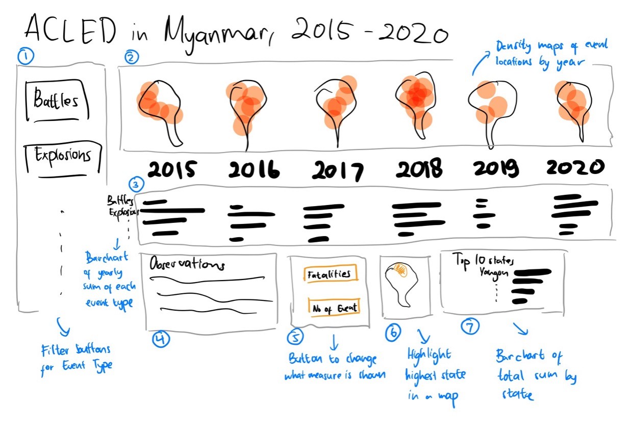 Due to the problem of the overlapping points (Clarity #1), I have decided to use another way to represent the spatial data. Initially, I thought of using a proportional symbol map with lower opacity to better represent the data, as the overlapping points will contribute to the size of the symbol. However, this method requires aggregation, and there is a problem in the mapping of the geographical data. There were hundreds of unrecognized location from the Admin 3 attribute (The third largest sub-national administrative region in which the event took place (Event Data Project (ACLED) 2019)). Aggregating on the higher level would not solve the issue. Even though the number of unrecognized location would be manageable to resolve manually, but the map will be less meaningful because it is too aggregated. Therefore, as shown in number 2 in Figure 7, I have decided to create density maps to represent the data instead.
This alternative resolves the issues shown in section 2 as the following. Numerical references in the section below are tied to the numbered items in the proposed alternative visualisation in Figure 7.
3.1 Clarity
Using density maps to show the geospatial patterns of the armed conflict events can take advantage of the overlapping points (2) . However since we cannot use varying colours for the density maps, a filter for the event types (1) is used instead.nes Only Violence Against Civilian](./images/2. Philippines Violence against Civilian.png)
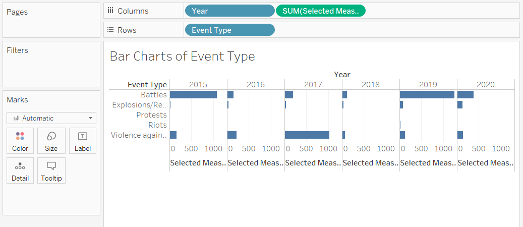
The visualisation will use a trellis for both the density map (2) and the bar chart (3). This allows the user to see the distribution of events in the geographical location as well as by event type by year.
The bar chart is broken down by year in the trellis (3). This would make is easier for the user to compare the values between event types, even though it might be difficult to compare different years. However, by standardizing the axes for the values, the user can still compare the height of the bars in different years when the difference is big.
Line chart is not used.
Using a filter instead of using different colours for each even type removes the need to put a colour legend.
Description is provided (4).
Use more descriptive axis labels (not shown in Figure 7).
Adjust the size to make sure they are not truncated (not shown in Figure 7).
3.2 Aesthetics
Do not use the default map background from Tableau but use the shp file for Myanmar to provide the map background (2).
The different event types are no longer differentiated by colours because it is used as a filter (1,2). The bar charts will also use the same colour for the bars. A colour palette of black and red will be used for this visualisation.
3.3 Interactivity
To improve:
Show the name of the location, the date or description of event in the tooltip (not shown in Figure 7).
Use animation (not shown in Figure 7).
3.4 Additional Features
Other than addressing the issues in the original visualisation, there are some additional features added to the dashboard.
- The codebook reveals that the data also stores the number of fatalities, which may also be of interest. Therefore, a parameter to toggle between displaying the values based on the number of events or fatalities is provided (5).
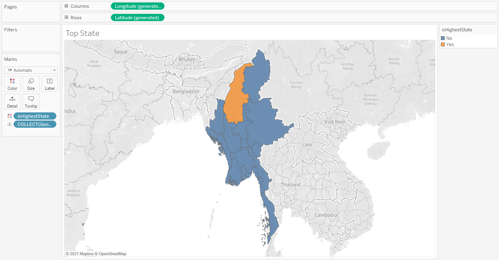
- To provide a high-level aggregate of the data, the state with the highest number of selected measure is highlighted (6). It will be done in the state level due to the unrecognized values in lower level. Showing the data in form of a map helps the user if they do not know the areas of Myanmar well.
- Comparing the aggregate values by state would also help the user to see the actual number of events (7), that will complement the density map.
4. Step-by-Step Description
I will assume you have some basic knowledge of Tableau, so I will not describe into very deep details for the routine Tableau operations such as importing data. Refer to my first dataviz makeover post if you need more details.
4.0 Set Up
- Download the data from Armed Conflict Location & Event Data Project using the Data Export Tool for Southeast Asia. WE can use the filters to get only the data we are interested in, such as Myanmar.
- Download the Myanmar map polygon data from ArcGISHub. Get the national boundary for the density map and the state and region boundary to highlight the state with the highest number of events or fatalities.
- Create a new Tableau workbook
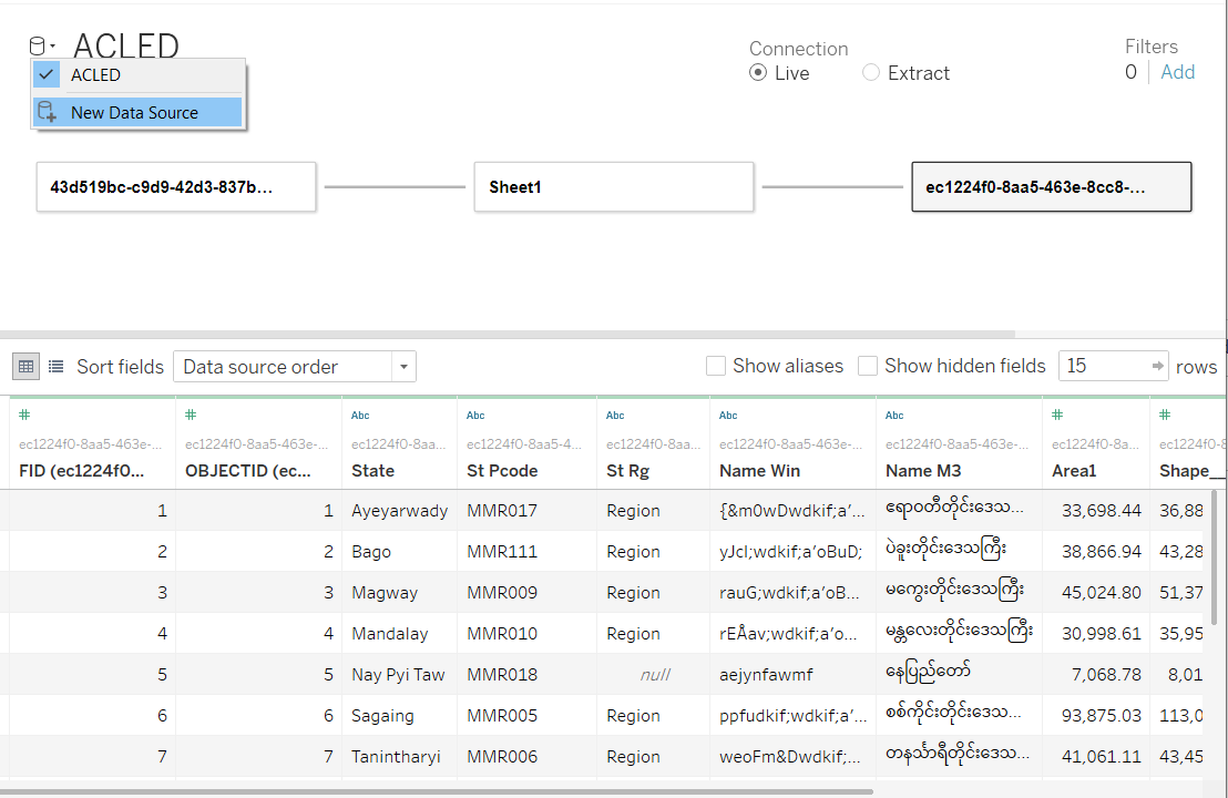
Join data from multiple sources together
- Connect to Data > Spatial File > Select the National Boundary data for Myanmar
- Add new data > Select the ACLED data
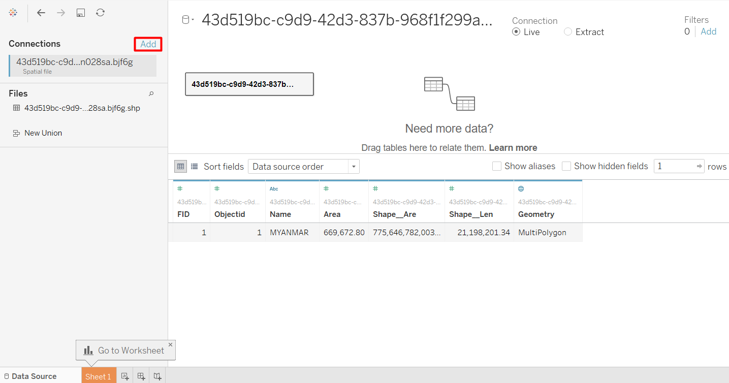
- Drag the File to the workspace to define a relationship, then select the fields to be matched. The Name field from the national boundary is equivalent to country in the ACLED data.
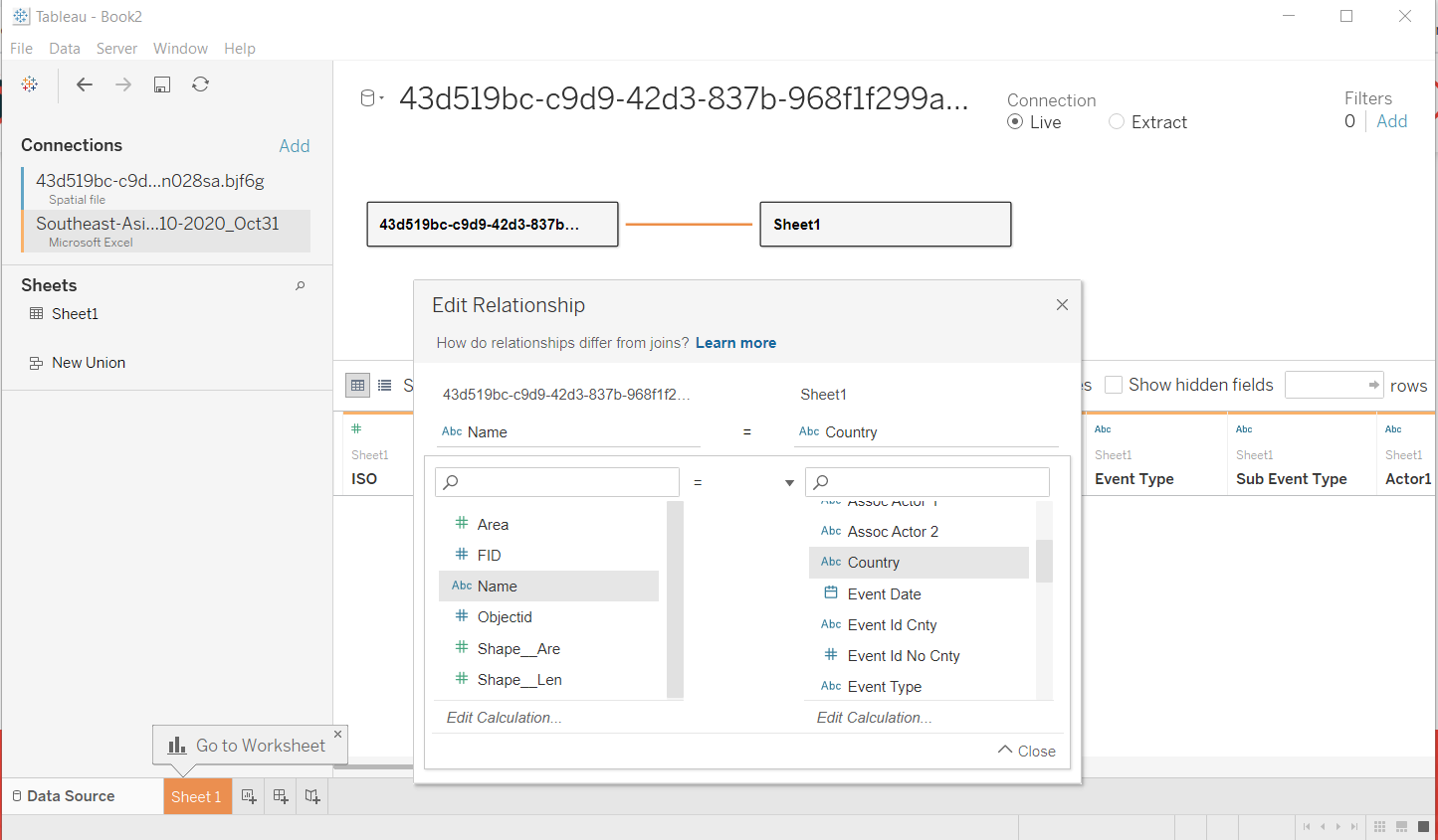
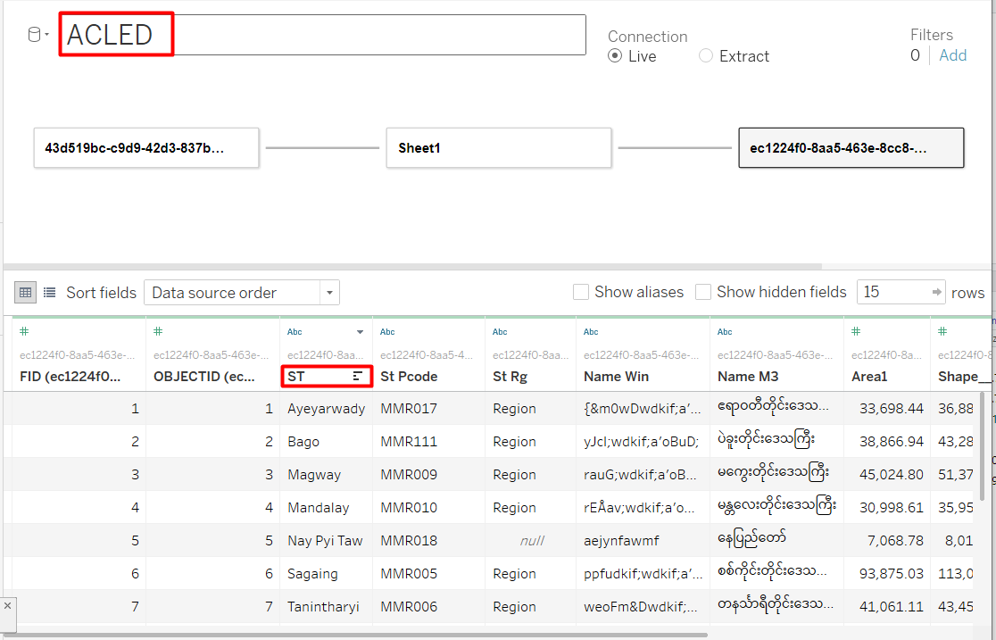
- Repeat adding the state and region boundary file, and define the relationship with the ACLED data. Admin 1 from ACLED should be equivalent to ST from the state and region boundary file.
- Just to make it easier to read, rename the connection by double-clicking on the connection name. Also rename ST to State so it will be easier to understand. Optional: Rename the tables to a more descriptive name such as National Boundary, ACLED, and State and Region Boundary.
Filter Data Source
The dataset that I have contains multiple countries in Southeast Asia, but since we are focusing on Myanmar, we can filter out the rest of the countries.
- Click Add button below “Filters”
- Click Add in the dialog window
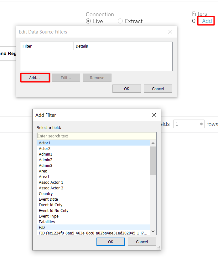
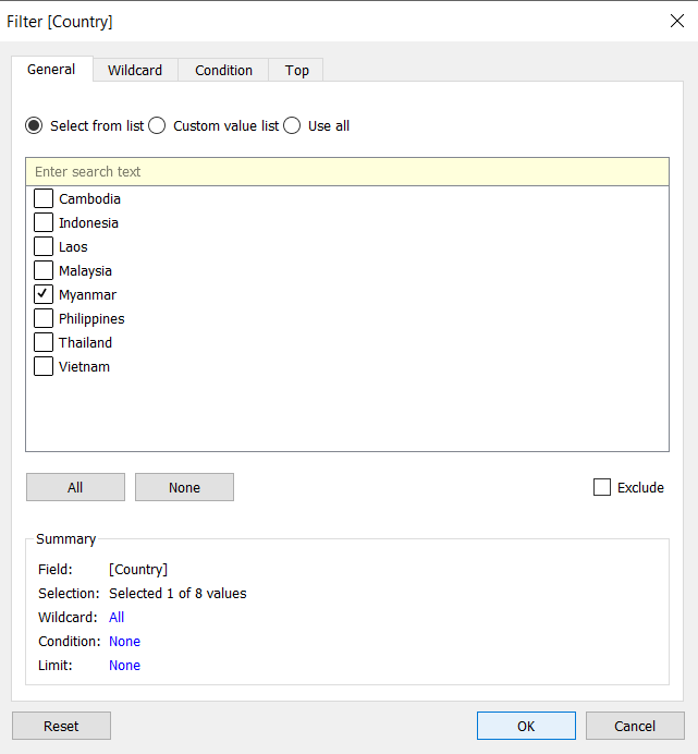
- Select the field to be filtered (Country)
- Only check the box for Myanmar
I also want to remove “Strategic Development.” As strategic development is a non-armed event. Repeat the steps, but this time we add filter for Event Type and exclude Strategic Development.
4.1 Create customised filters
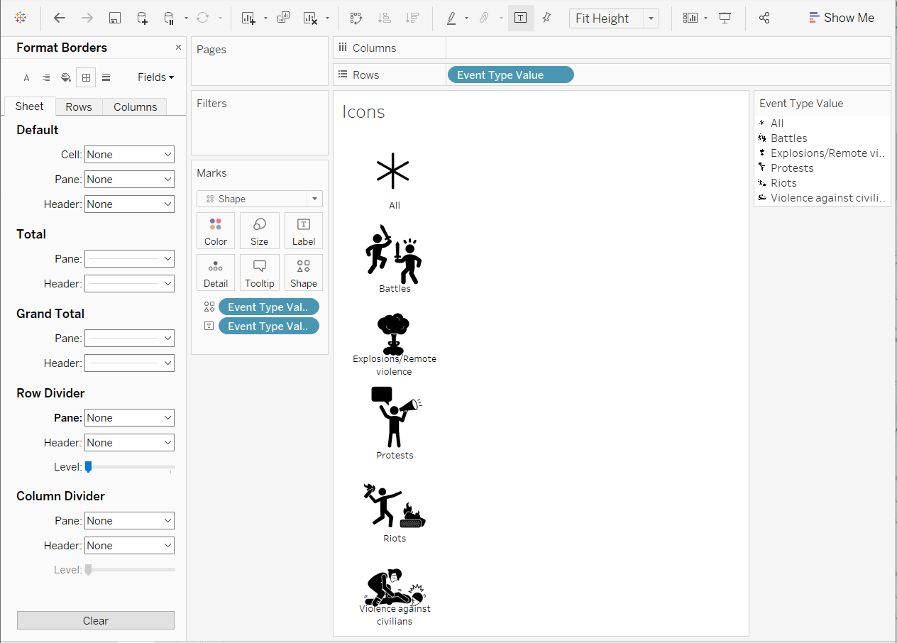
We can use parameters to simulate a custom filter. I have decided to use icons as the buttons, so first we need to download the icons first. I got my icons from The Noun Project.
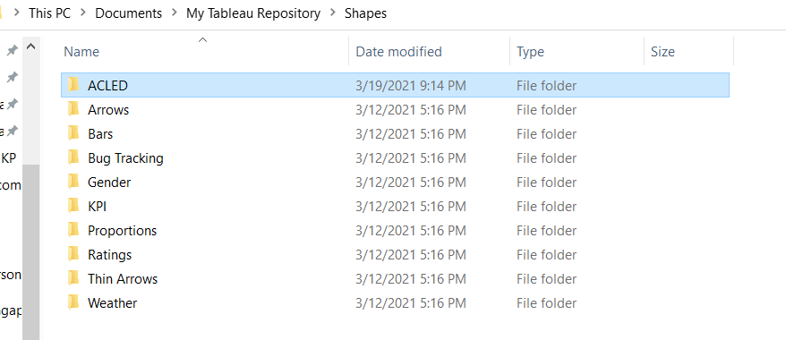
- Put the icon jpeg files in a new folder inside My Tableau Repository/Shapes folder, usually in Documents but it might be different.
We also need to create an Excel file containing all the values for the icons.
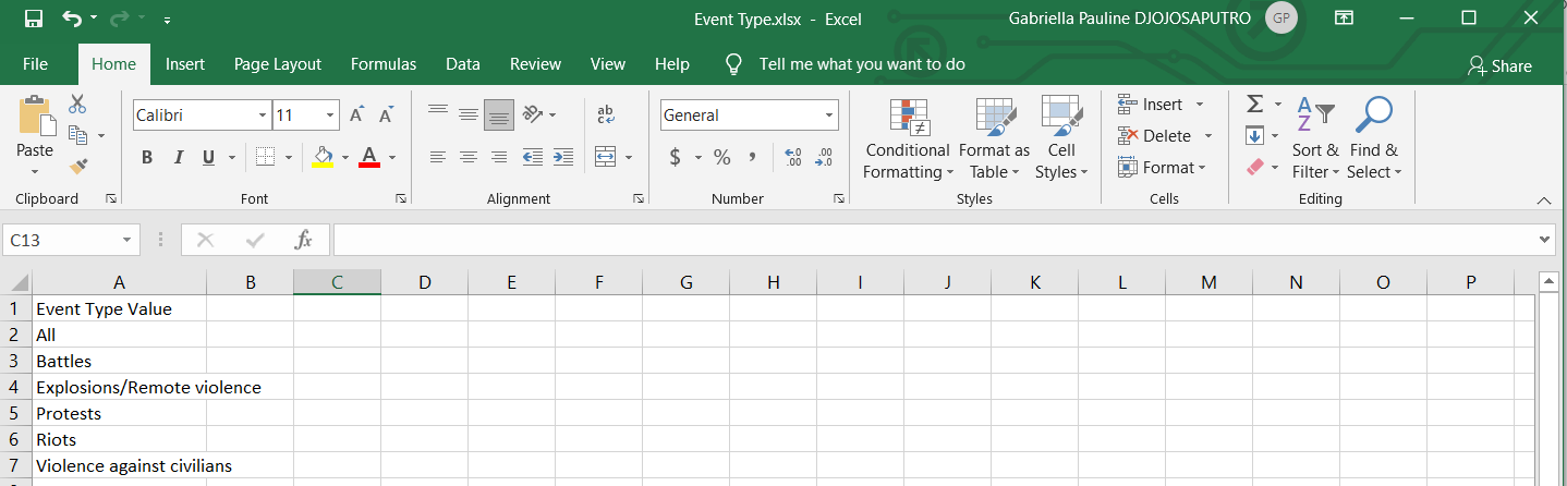
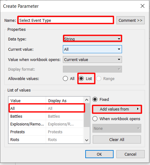
I added a value called “All” on top of the existing event types.
- Go to Data Source Tab and add a new connection
Create Parameter
From the data pane, click on the grey triangle beside the search box > Create Parameter…
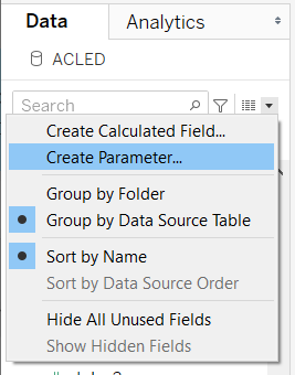
A dialog box will appear for us to enter the details of the parameters
- Enter parameter name
- Change data type to String
- Change allowable values to List
- To reduce some manual work, click Add values from > your newly created excel file > Event Type Value. This will auto-populate the parameter values with the values of Event Type Value in the spreadsheet that we have just created.
Create custom icons
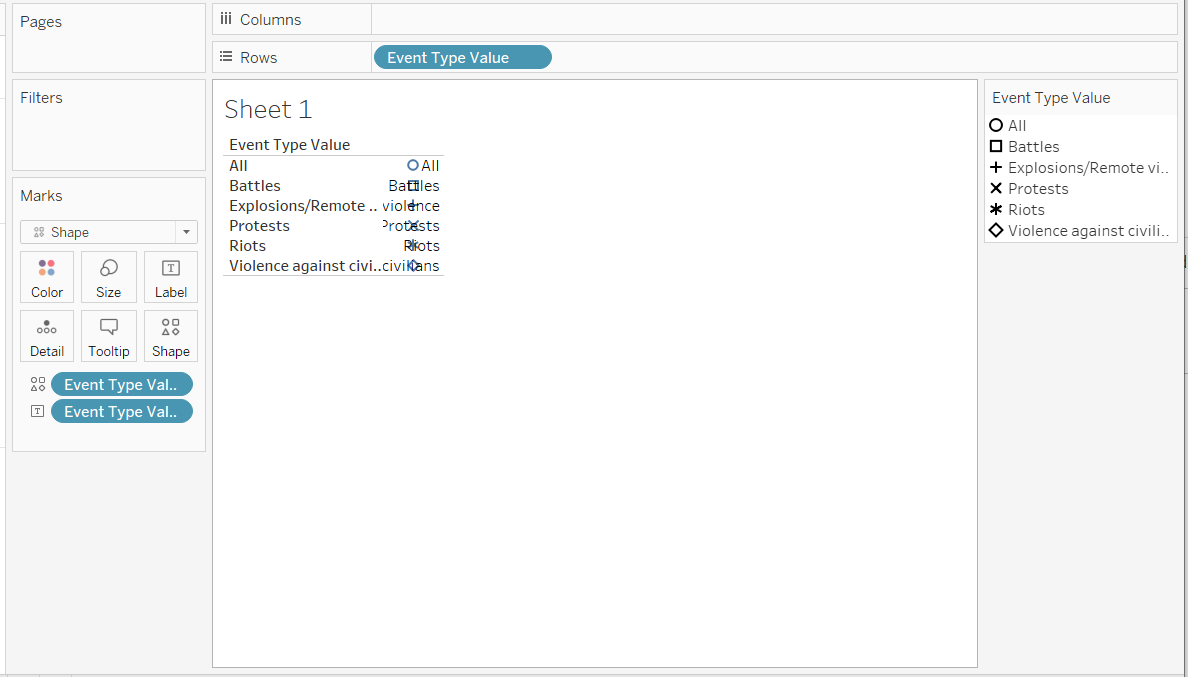
- Create a new worksheet
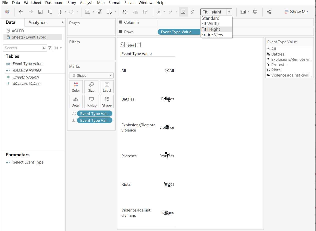
- Drop the Event Type Value to Rows shelf to make it be displayed in multiple rows and Label on the Marks Card to actually label the icons.
- Change the Marks Type to Shape
- Drop the Event Type Value to Shape on the Marks Card
Your screen should look like the screenshot below.
- Double-click on the Shape on the Marks Card to open the Edit Shape window
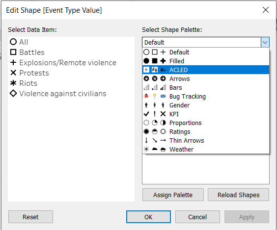
Your new custom icons should appear under Shape Palette. If it doesn’t, try Reload Shapes or close the workbook and open again.
- Click on the data item then click on the icon to assign the icon to a particular data item
- Click Apply > OK
Now We just have to do some adjustments to make it look nicer.
- Change the display from Standard to Fit Height
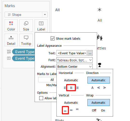
- Double-click on the Label on the Marks Card and change the alignment to bottom-center.
Unshow the header by right-clicking on the Event Type Value pill in the Rows Shelf > Uncheck Show Header. We do not need it anymore because we already have the label.
Double Click on the Size on the Marks Card and adjust the size to make the icon bigger
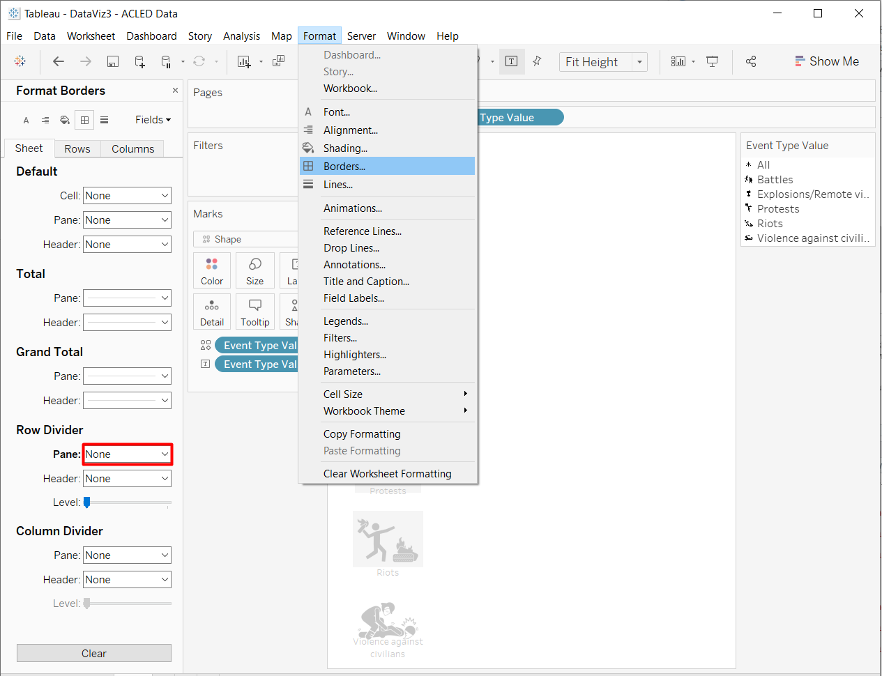
Remove the lines on the top and bottom of the icons. From the drop-down menu, click Format > Borders then change the Pane Row Divider to None in the panel.
We have done the first element of the visualisation. Your screen should look like the screenshot below. The linking for the filter will be done later at the dashboard.
4.2 Density Maps
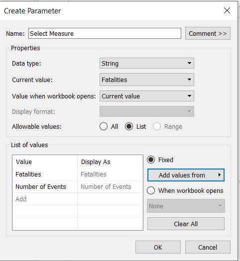
For the density maps, we will need to create another parameter and several calculated fields.
Parameter
Repeat the steps to create parameter shown in section 4.1 for a parameter called Select Measure. The values in the Excel file are “Fatalities” and “Number of Events.”
The properties of the parameter is shown below.
Calculated Fields
To create calculated fields, click the grey triangle beside the search bar like if you are going to create a parameter > Create Calculated Field… Make sure that the ACLED Data Source is selected.
The calculated fields to be created are as the following:
- Filtered Event ID
if [Select Event Type] == "All"
  then [Event Id Cnty]
elseif [Select Event Type] == [Event Type]
  then [Event Id Cnty]
end
Create Density Map
We need a dual axis to create the density map if we want to remove all background maps. We will only use the National Boundary as the background map.
- From the Data Pane, under ACLED data, drop Longitude to Columns shelf and the Latitude to Rows shelf, 2 times.
Your screen should look like the screenshot below.
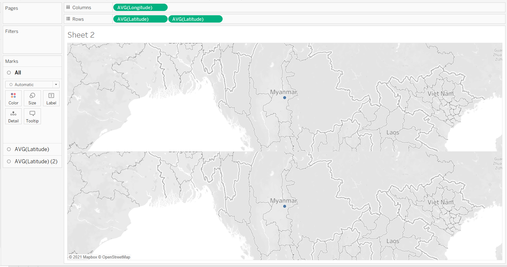
- Change the marks type of the first AVG(Latitude) Marks Card to Map
- Add Geometry of National Boundary to Detail on the Marks Card
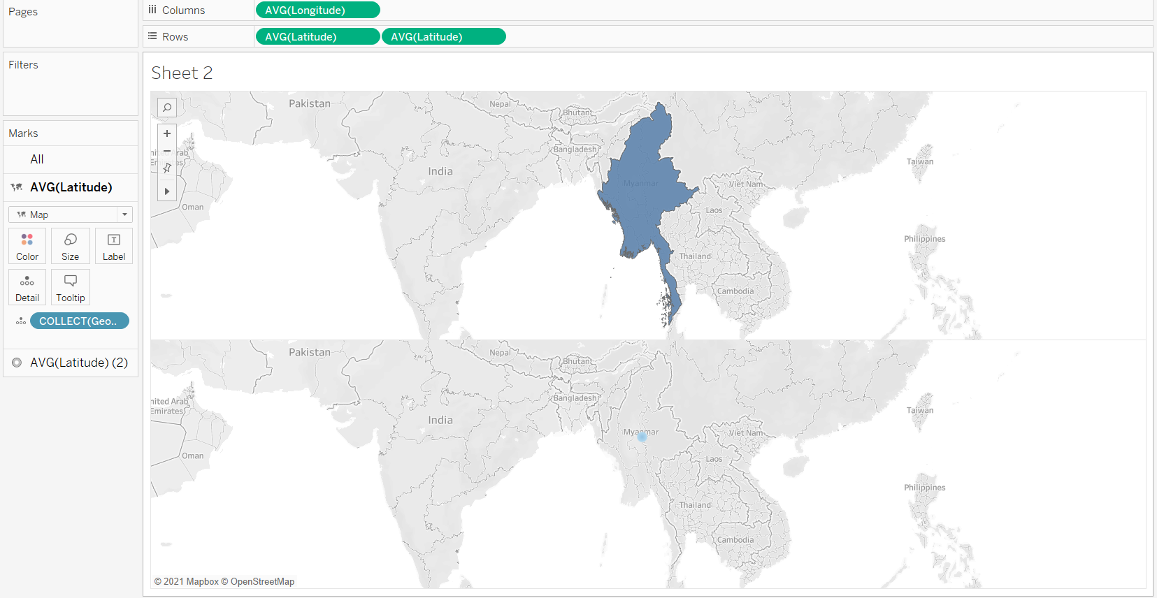
- Change the Marks type of the second AVG(Latitude) Marks Card to Density
- Add Filtered Event ID as the level of detail
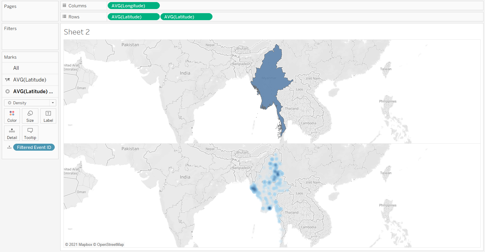
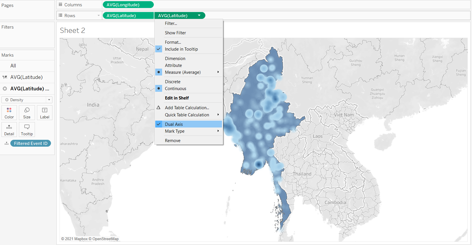
- Right click on the second AVG(Latitude) pill on the Rows Shelf > Dual Axis
Create Trellis Map
To create trellis map, we are going to add an additional field in the Columns shelf Tableau can automatically create the chart for us.
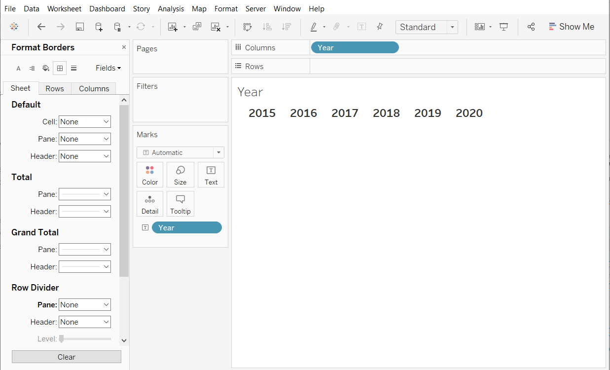
- Drop Year to the Columns Shelf, in front of AVG(Longitude)
- Right-click on the Year pill on the Columns shelf from Continuos to Discrete.
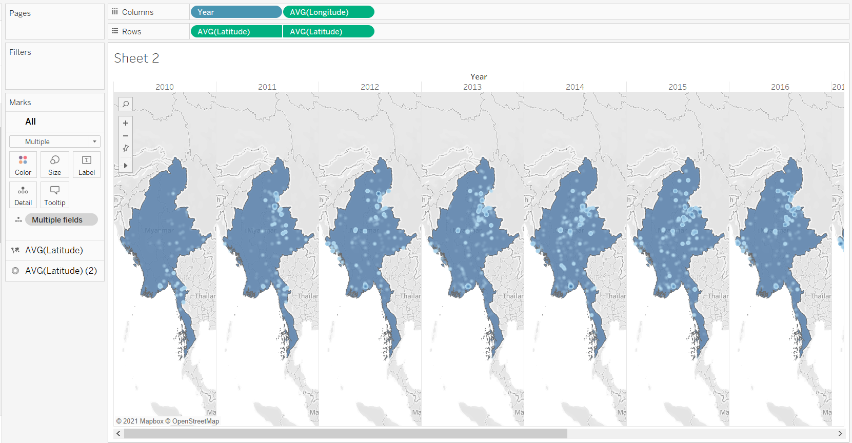
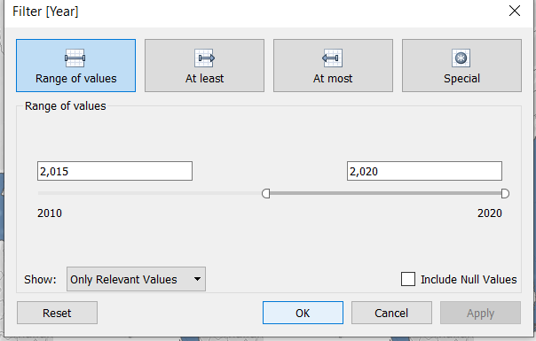
- Add Year filter to only show the data between 2015 and 2020. We can do this in Data Source tab to make the filter works globally in the workbook.
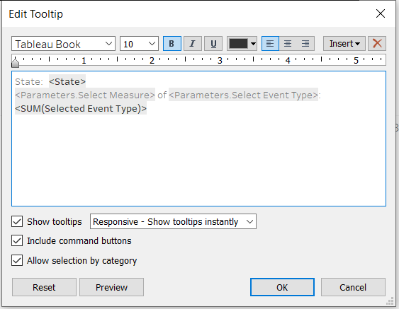
Edit Tooltip
We want to make the tooltip more informative, so we need to add the fields to the Tooltip on the Marks Card first.
- Select the Marks Card for density map (the second AVG(Latitude) marks)
- Add the fields of interest (Notes, Location, and State) to the Tooltip
- Double-click on the Tooltip icon to edit the text being shown. ‘<>’ indicates that it is a variable.
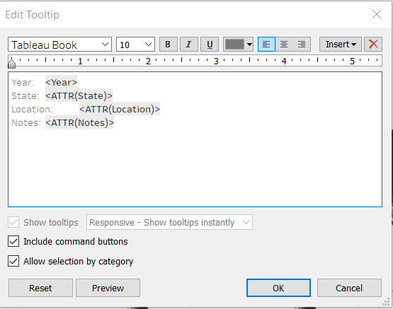
- Edit the Tooltip for the Background Map in the first AVG(Latitude) marks card to remove everything. We don’t want to see a tooltip when the user hovers over the background map.
Adjust Formatting
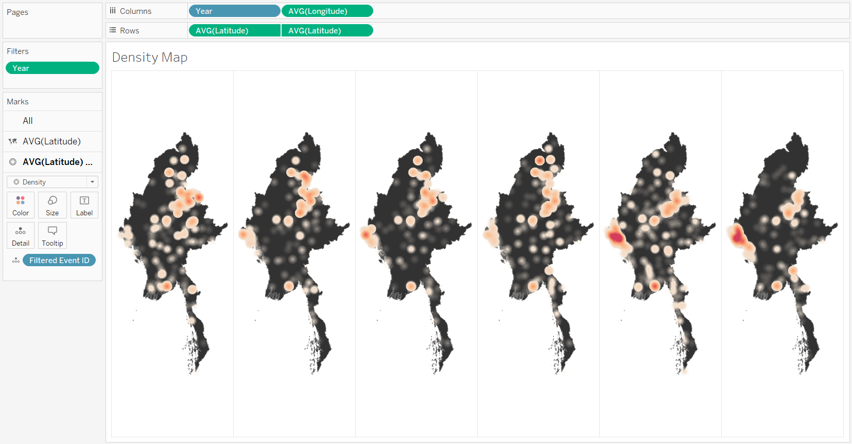
- We can rename the Sheet for easier referencing, the title will not be displayed in the dashboard.
- Remove the background map by clicking Map in the drop-down menu > Map Layers… > Slide Washout to 100%
- We can adjust the colour of the map, colour and size of the density marks using the Marks Card.
- I used Density Orange-Light Colour with 75% intensity and 100% opacity for the density
- Black for the background map
- Repeat steps to remove the header so the year will not be shown. We will use another sheet to give the Year label later.
- Remove map interactive functions such as pan and zoom. Since we only have Myanmar map, this function is not necessary.
- From Map in the menu drop-down, select Map Options…
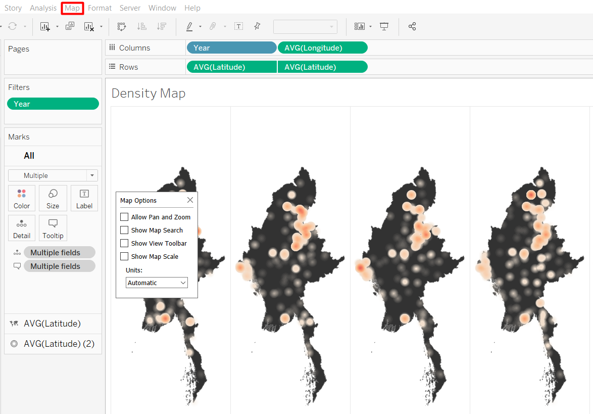
The final look for my density map is shown below.
4.3 Trellis Bar Charts
We will have a breakdown of the event type under each cell of density map. We will need to create several parameters and calculated fields first.
Parameter
- Repeat the steps to create a parameter
- Create an Excel file for the possible values (“Fatalities” and “Number of Events”) with “Measure” as the Field name.
- Add new data source
- Open a new worksheet and from the Data pane select Create Parameter…
The properties of the parameter should look as the following.
Calculated Fields
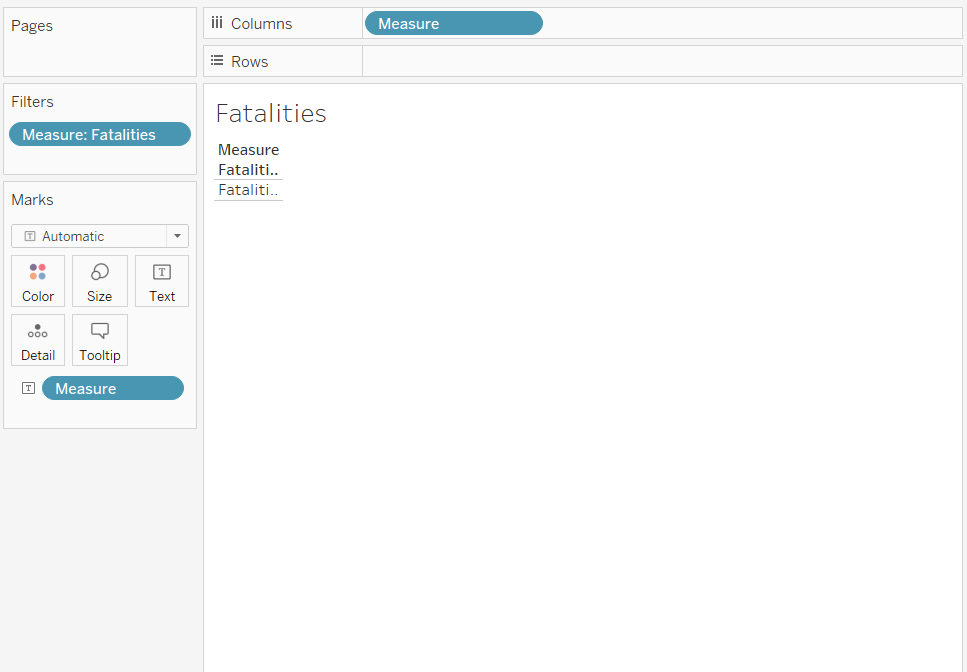
We need more calculated fields to enable the interactive functions to select the measure to be displayed, whether it is the number of events or the number of fatalities. The name of the calculated fields and the formulas are listed below.
- Number of Records
1- Selected Measure
CASE [Select Measure]
when "Number of Events" then [Number of Records]
when "Fatalities" then [Fatalities]
END
Create Bar Chart for Selected Parameter
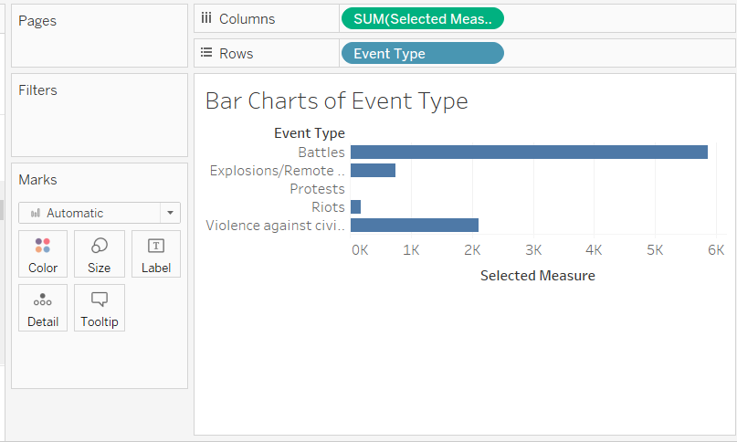
- Drop Selected Measure to Columns shelf and Event Type to Rows Shelf. Sum aggregation will be chosen by default for the Selected Measure. This will count the total of the Selected Measure calculated field for each Event Type.
Your screen should look like the screenshot below.
- Repeat steps to make it a trellis display
- Add Year to the Columns shelf
- Convert Year to Discrete
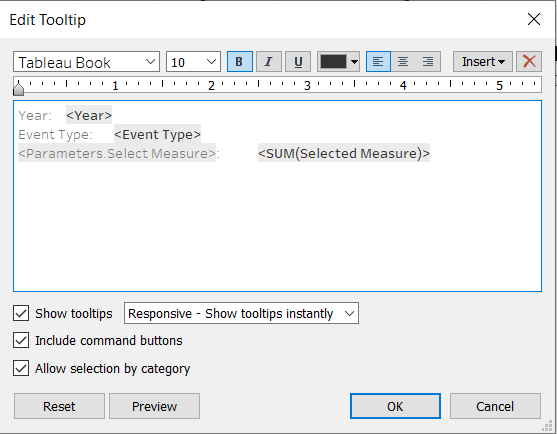
Edit Tooltip
- Repeat the steps to edit the tooltip, and change the “Selected Measure” to Parameters.Select Measure, as shown in the screenshot below.
Adjust Formatting
Rather than repeating all the y-axis label for each cell, we will create a dynamic text to show what measure is being displayed later. * Double-click on the “Selected Measure” axis label * Delete the Title and leave it empty

- Repeat steps to remove the header so the year will not be shown.
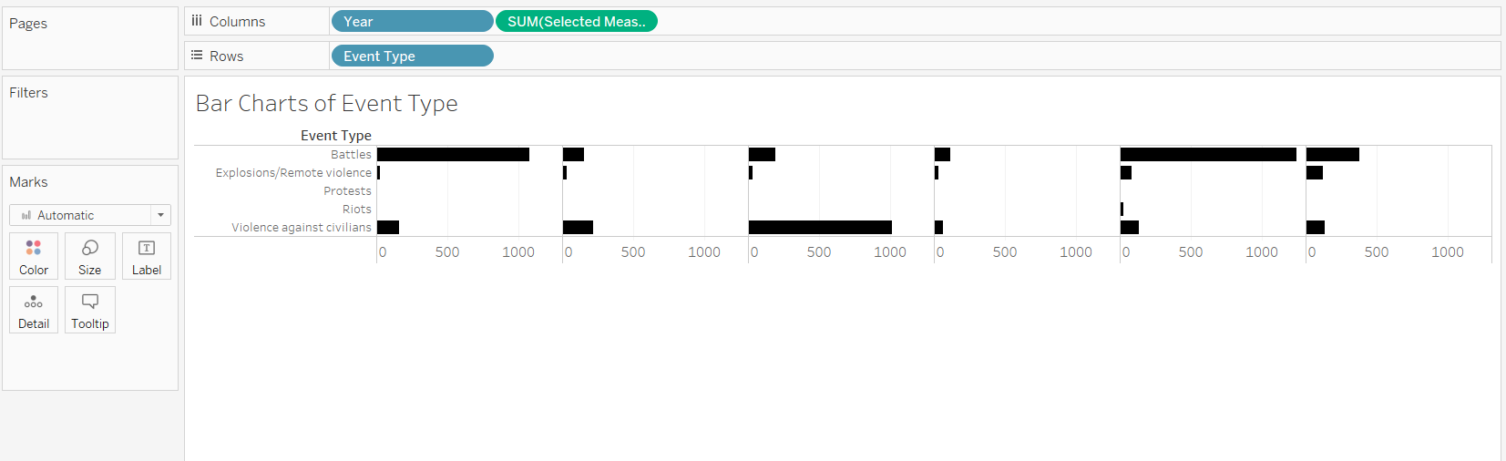
- Change the colour of the bar chart to black from Color on the Marks Card.
- Ensure the Event Type is not truncated
- Right click on the Event Type row labels > Format…
- Change Default Font to size 8
- Hover over the right side of the red-coloured box shown below until a double-sided arrow appears and drag to the right to make the column for event type wider.
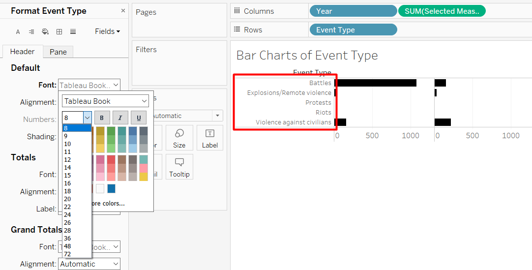
The trellis bar chart should look like the screenshot below.
4.4 Top State Highlight Map
For this visualisation, we will use the State and Boundary as the Background map and highlight the state with the highest sum of measure using a red colour. The steps to highlight the max value is inpired by Rahul (2017) and Tableau Knowledge Base(2017). As with the previous visualisations, we need to create a calculated field first.
Calculated Fields
We will make use of the fixed function which disaggregates the calculation and use a fixed level of detail (Tableau 2020). Without using fixed function, we will get an error saying an aggregate field cannot be further aggregated.
- Selected Event Type
if [Select Event Type] == "All"
then [Selected Measure]
elseif [Select Event Type] == [Event Type]
then [Selected Measure]
else 0
end- Max Measure
Max({fixed [State]: sum([Selected Event Type])})- isHighestState
if {fixed [State]: sum([Selected Event Type])} == {fixed:[Max Measure]}
then "Yes"
else "No"
end
Map with Highest State Highlight
- Drop the Geometry from State and Region Boundary to the workspace
- Drop isHighestState to Color on the Marks Card
Your screen should look like the screnshot below.
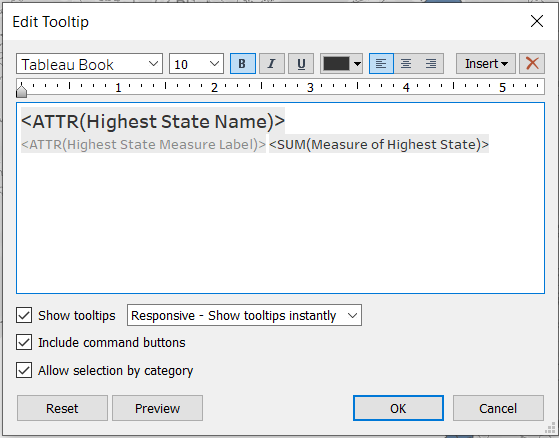
Edit Tooltip
We are going to create two more calculated fields just for the tooltip. We will return a value for the highest state but return NULL for the rest. This is to prevent the tooltip from showing if the user hovers over the other states.
- Create the following calculated fields
- Highest State Name
if [isHighestState] == "Yes"
then [State]
else NULL
END- Highest State Measure Label
if [isHighestState] == "Yes"
then [Select Measure] + " of " + [Select Event Type] + " :      "
else NULL
END- Measure of Highest State
if [isHighestState] == "Yes"
then {fixed: [Max Measure]}
else NULL
END- Drop the three calculated fields to Tooltip on the Marks Card
- Edit the Tooltip to only show the calculated fields. We also adjust the font size and other properties.
Adjust Formatting
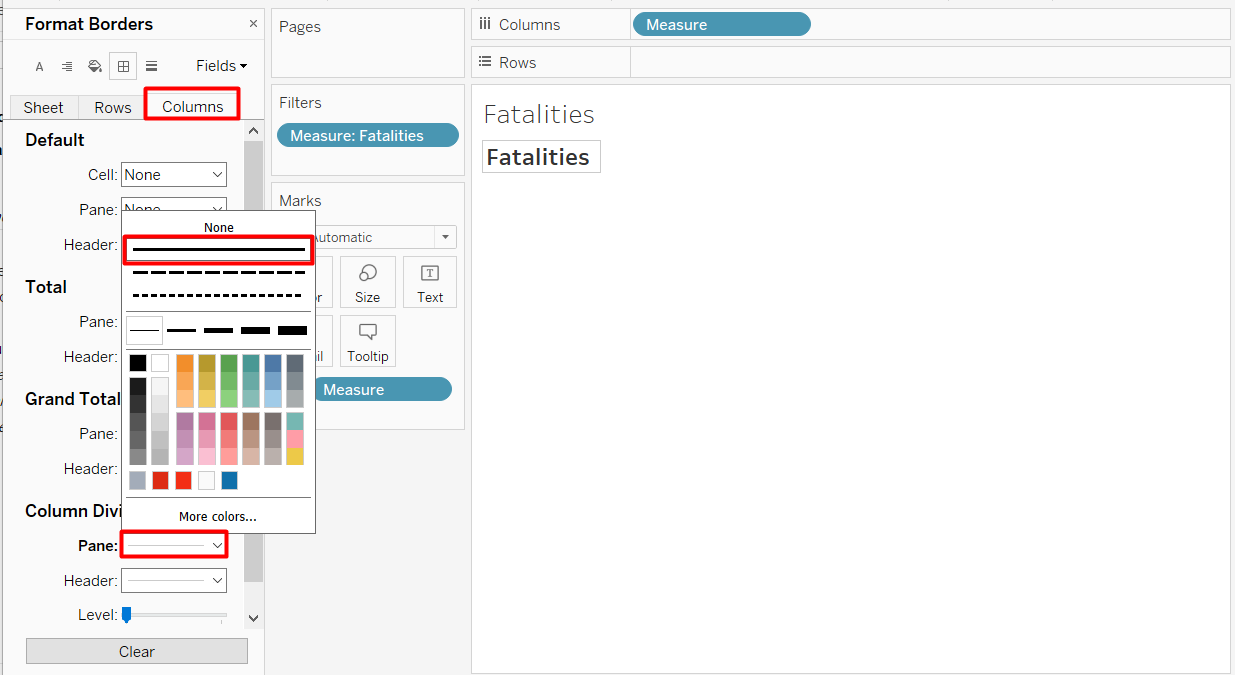
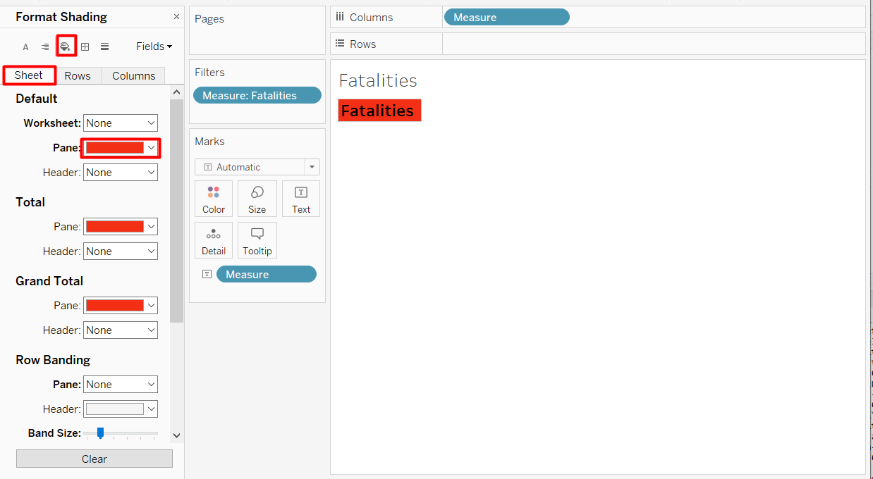
As with the density map, remove the background map and remove interactive map features. Map > Map Layers… > Washout = 100% * Map > Map Options… > Uncheck all * Change the colour of the map * Double-click on Color on the Marks Card * Increase Opacity to 100% * Click Edit Colors… > Change “No” to black and “Yes” to red * Remove border by clicking Format menu > Borders > Rows > change Pane Row Divider to None * Repeat for columns
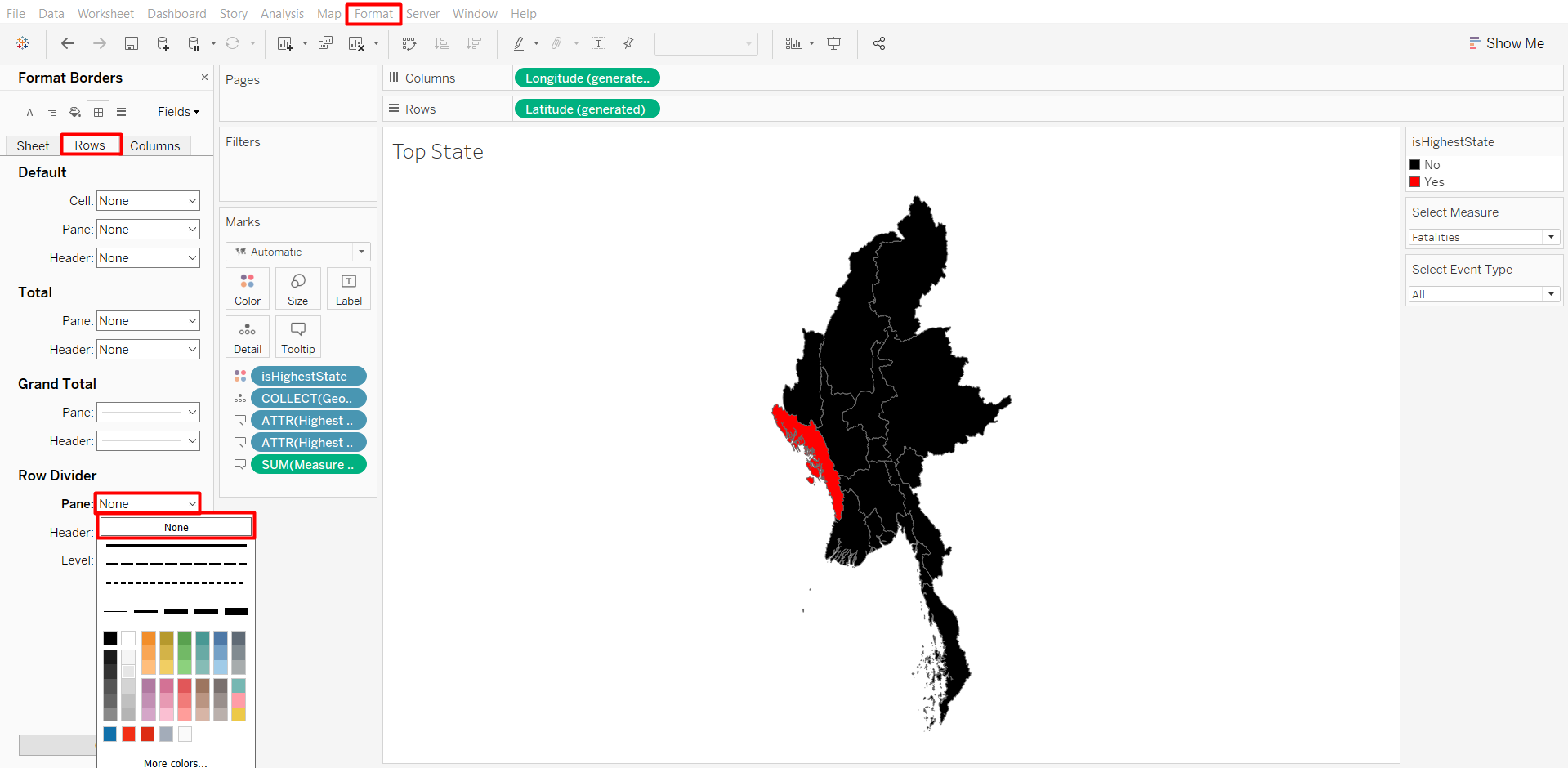
After the formatting, your screen should look similar to the screenshot below.
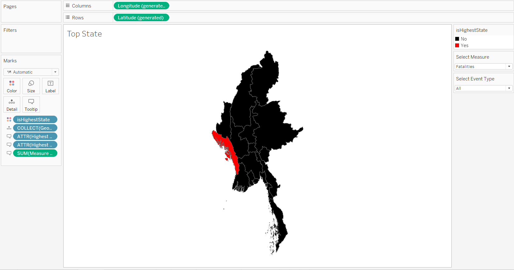
If the state that is being highlighted is different, it might be due to the different parameters being selected. The parameters that were selected on this screenshot is Fatalities of Protest event type. If we want to change it, we can right-click on the parameters on the Data Pane > Show Parameter.
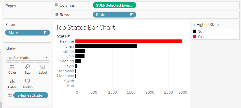
4.5 Top States Bar Chart
Next, we are going to use the existing calculated fields to create a bar chart that displays the top 10 states in descending order by the values selected in the parameter.
- Drop Selected Event Type to the Columns shelf, State to the Rows shelf, and isHighestState to Color on the Marks Card
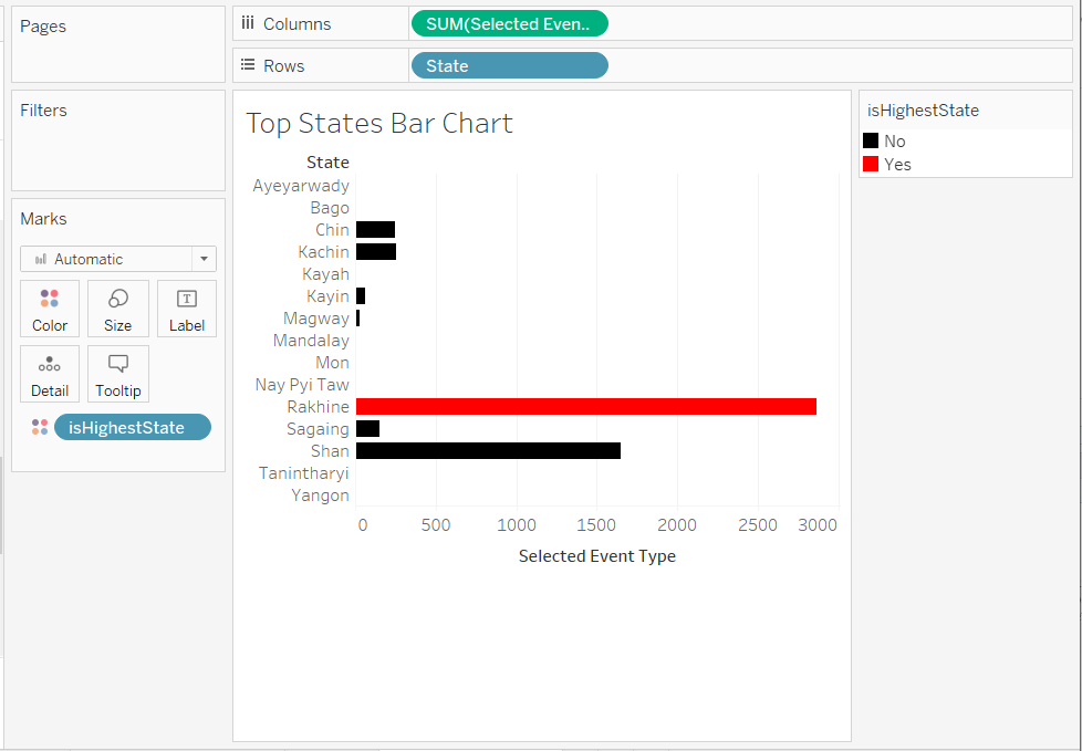
- Right-click on the State Row Header > Sort Descending
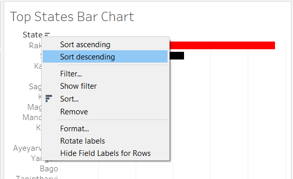
- To add the filter, do the following steps:
- Right-click on the State Row Header > Sort Descending
- Select Top > By Formula
- Enter the following formula:
SUM([Selected Event Type])
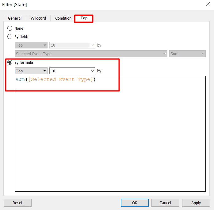
Your screen should only show 10 states now.
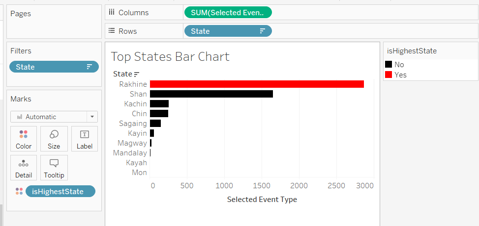
Edit Tooltip
- Double-click on Tooltip on the Marks Card
- Remove the isHighestState from the Tooltip and change the “Selected Event Type” Label to a dynamic value from the Parameters.Select Measure and Parameters.Select Event Type
Adjust Formatting
- Remove the x-axis label by double-clicking on the label > Delete Title > Close dialog box
The final look for top states bar chart is shown below.
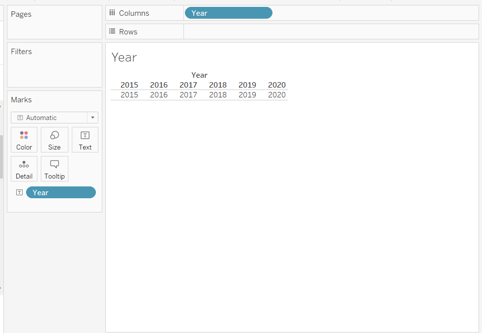
4.6. Year Label
We are going to create a year label to replace the labels in the density maps and the trellis bar charts that we have removed.
- Create a new sheet
- Add Year to the Columns shelf and Text on the Marks Card
- Convert the Year from Continuous to Discrete
Your screen should look like the screenshot below.
- Adjust the format of the text to make it bolder and larger by double-clicking on Text on the Marks Card
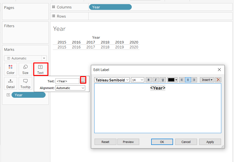
- Remove the Year header by right-clicking on the Year pill on the Columns shelf > Uncheck Show Header
- Remove the lines by clicking on the Format from the menu drop-down > Borders > Change Row Pane Divider to None
The formatted year label is shown in the screenshot below.
4.7 Measure Parameter Buttons
For the measure parameter buttons, we need to create each button separately in different sheets so we can move the buttons freely.
- Create New Sheet called Fatalities
- Add Measure from the Measure Data Source that we created in the Excel file to the Columns shelf, Text on Marks Card, and Filters
- Only keep “Fatalities”
Your screen should look like the screenshot below.
- Adjust the formatting to make it look like a button
- Repeat the steps to remove header
- Repeat the steps the text format make it bigger and bolder
- Add the column border by clicking Format from the menu drop-down > Borders > Column > Change Pane Column Divider to the first line under “None”
- Change the background colour by clicking the bucket icon in the Format pane > Sheet > Change Pane colour to red
- Change the colour of the text to make it more readable, such as white colour
The final look of the button sheet looks like the screenshot below.
Repeat the steps to create another button for Number of Events.
4.8 Dashboard
We will now combine all the different components into one dashboard.
- Create a new dashboard and adjust the size. We will use PowerPoint (1600 x 900) in this example.
- Arrange the Sheets and Objects so it will look like the screenshot below.The legend of which element is on the dashboard is shown in the left side.
- Drag the elements to the dashboard from the outermost layer to the innermost layer. Please note that some dummy texts and some adjustments are done to make the layout fit.
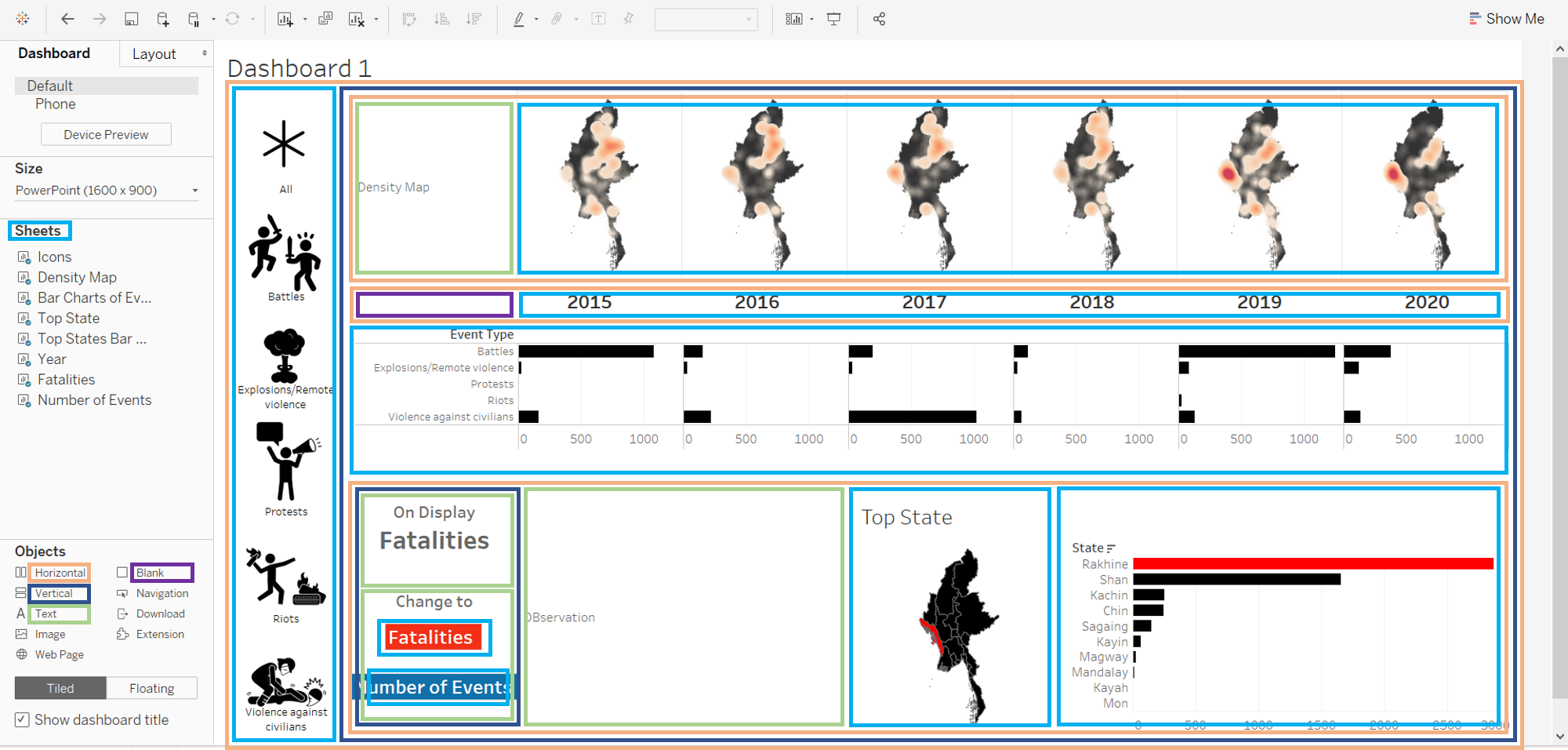
There is also a text object at the bottom, but it is truncated due to the screen size.
- To resize the layout, we can click the Fit drop down above the dashboard and change from standard to fit height or fit width. If it does not work, we can hover to the right corner of the sheet to resize the width or to the bottom of the sheet to resize the height.
- I have removed the title on the top states bar chart by changing the colour to white so it will stay aligned with the map on its left side.
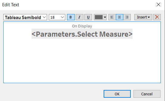
- The On Display text object is a dynamic text that shows the selected filter. Use the following formula to display the value.
Use Sheets as Custom Filter
We have 3 sheets in the dashboard that is meant to be used as a filter: Icons, Fatalities, and Number of Events. We can change the value of parameters according to actions performed on these sheet.
- Click Dashboard from the menu drop-down > Actions…
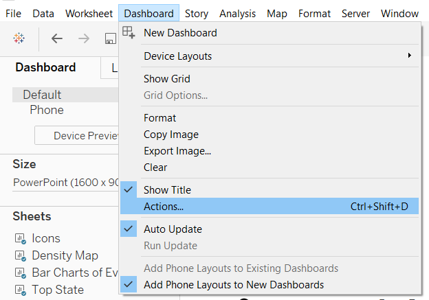
- Click Add Action > Change Parameter…
- Use the following properties for the parameter
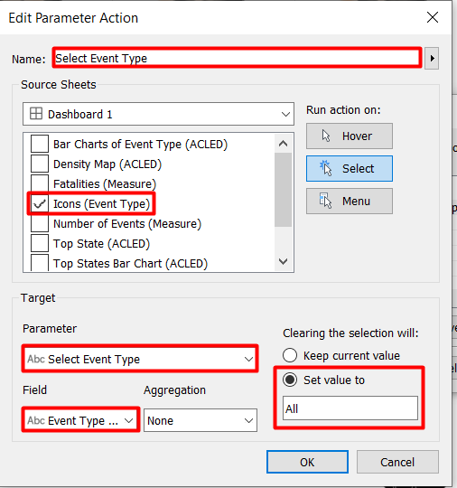
- Add a name for the parameter action
- Source Sheet means the the parameter change will be performed when the user performs an action on the source sheet. Set the Source sheet to Icons.
- Target is the parameter that we are going to change. We will use the icons to change the Select Event Type parameter to the Event Type Value of the icon that is clicked.
- We want to have “All” as the default, so set back the parameter to “All” when selection is cleared.
We can try to click the different icons and observe how the density maps and the top states visualisation changes according to the selection. Note that the trellis bar chart will not change because it always has all event types by default.
Repeat adding parameter action for the Fatalities with the following propoerties.
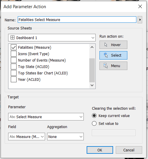
Repeat again for Number of Events, keeping all the properties for Fatalities Select Measure action except changing the source sheets to Number of Events only.
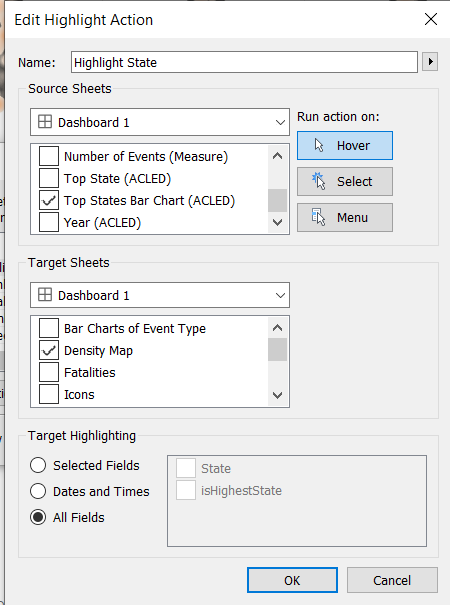
Add Highlighter
We will use the year as a highlighter, but we will use hover action instead of select. * Click Dashboard menu > Actions… > Add Action > Highlight … * Set the Action as hover and source sheet as Year. * Only keep Bar Charts of Event Type and Density Map as the target sheet.
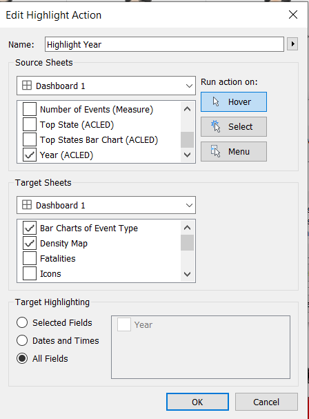
- Repeat the steps to add another highlighter for state with the following configuration
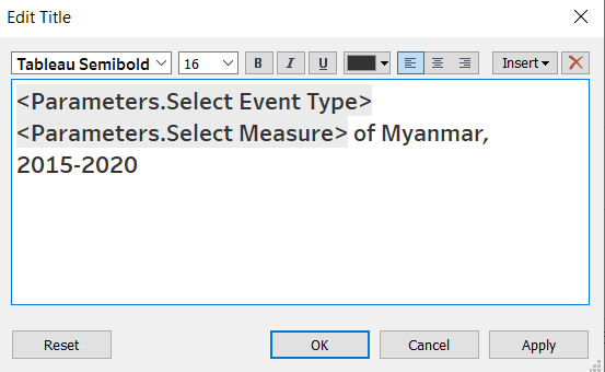
- Edit the Title to be dynamically changing based on the selected parameters.
- Double-click on the Title. Enter the following
Congratulations! We have completed our dashboard.
5. Major Observations
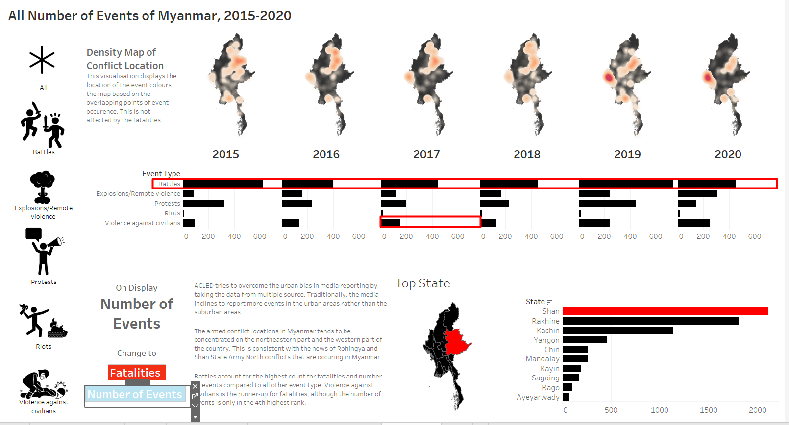
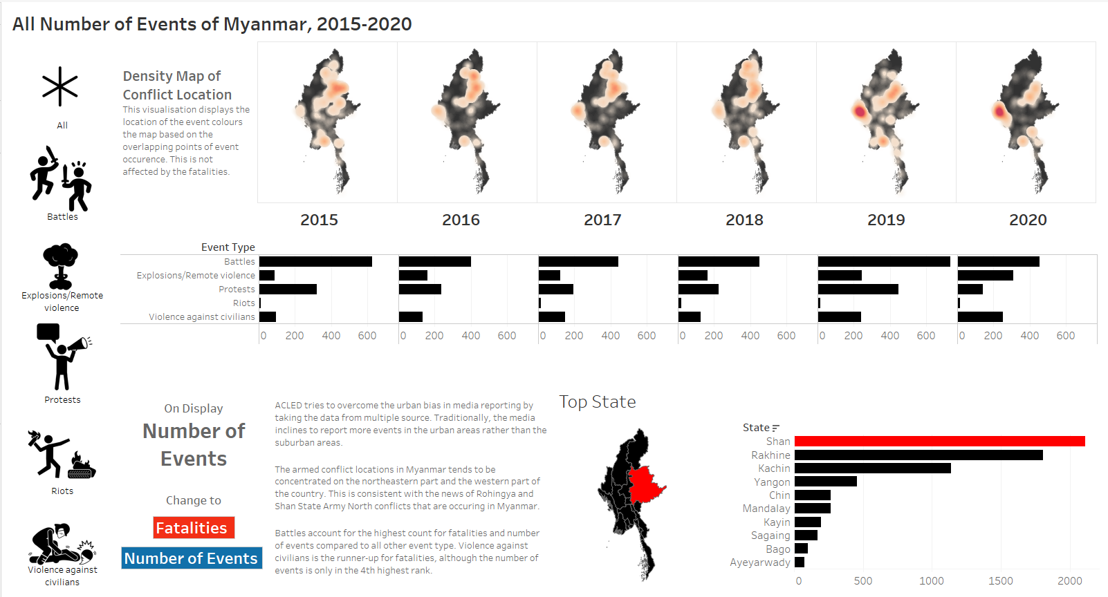
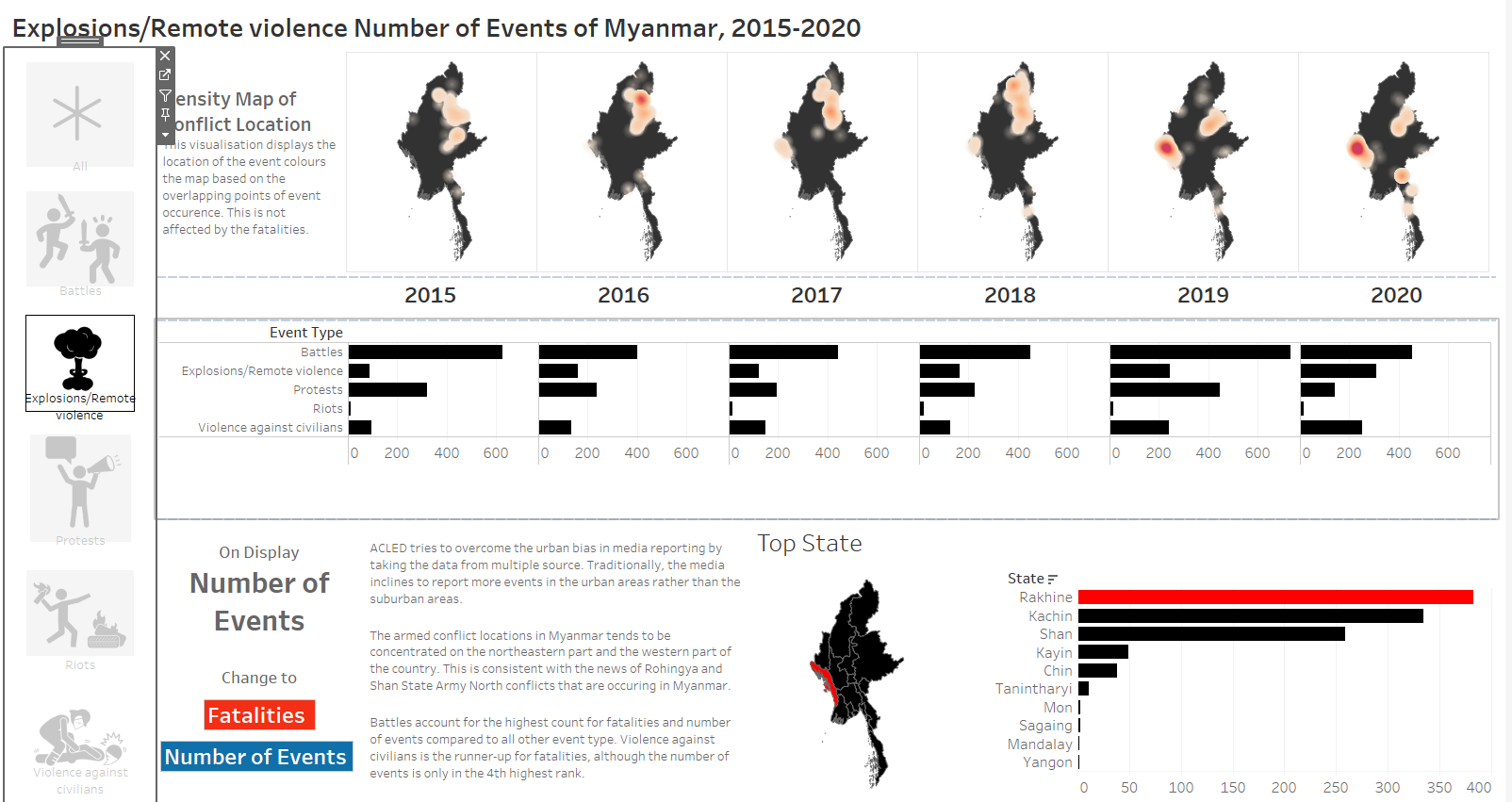
a. Armed Conflict Events are concentrated on the northeastern and western part of Myanmar
This is consistent to the Rohingya and Shan State Army - North conflicts that we may have seen in the news.
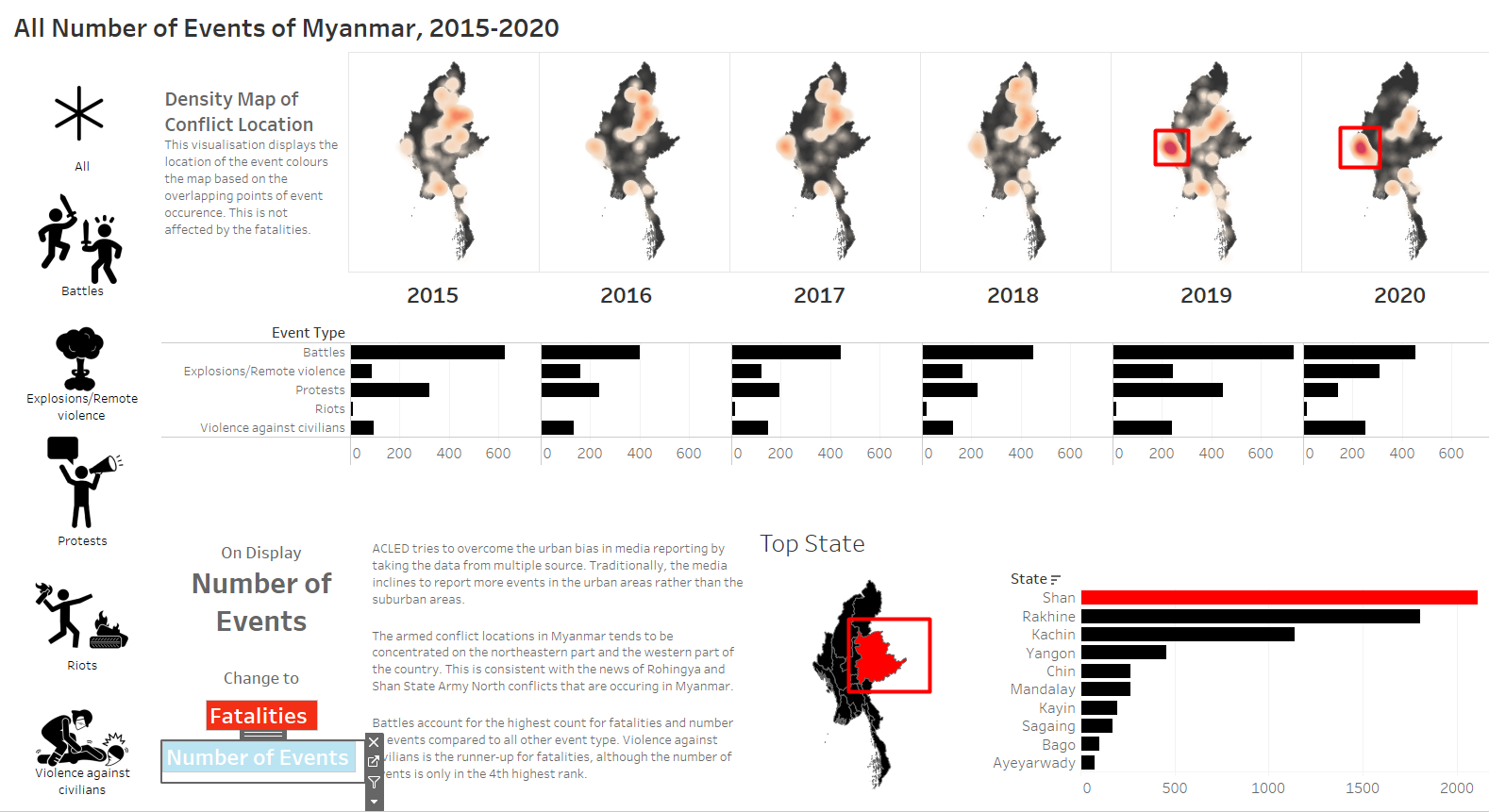
The total number of events are highest in Shan, with more concentration on the western part of Myanmar on 2019 and 2020.
b. Protests can happen anywhere in the country, but Yangon accounts for the highest number of protests
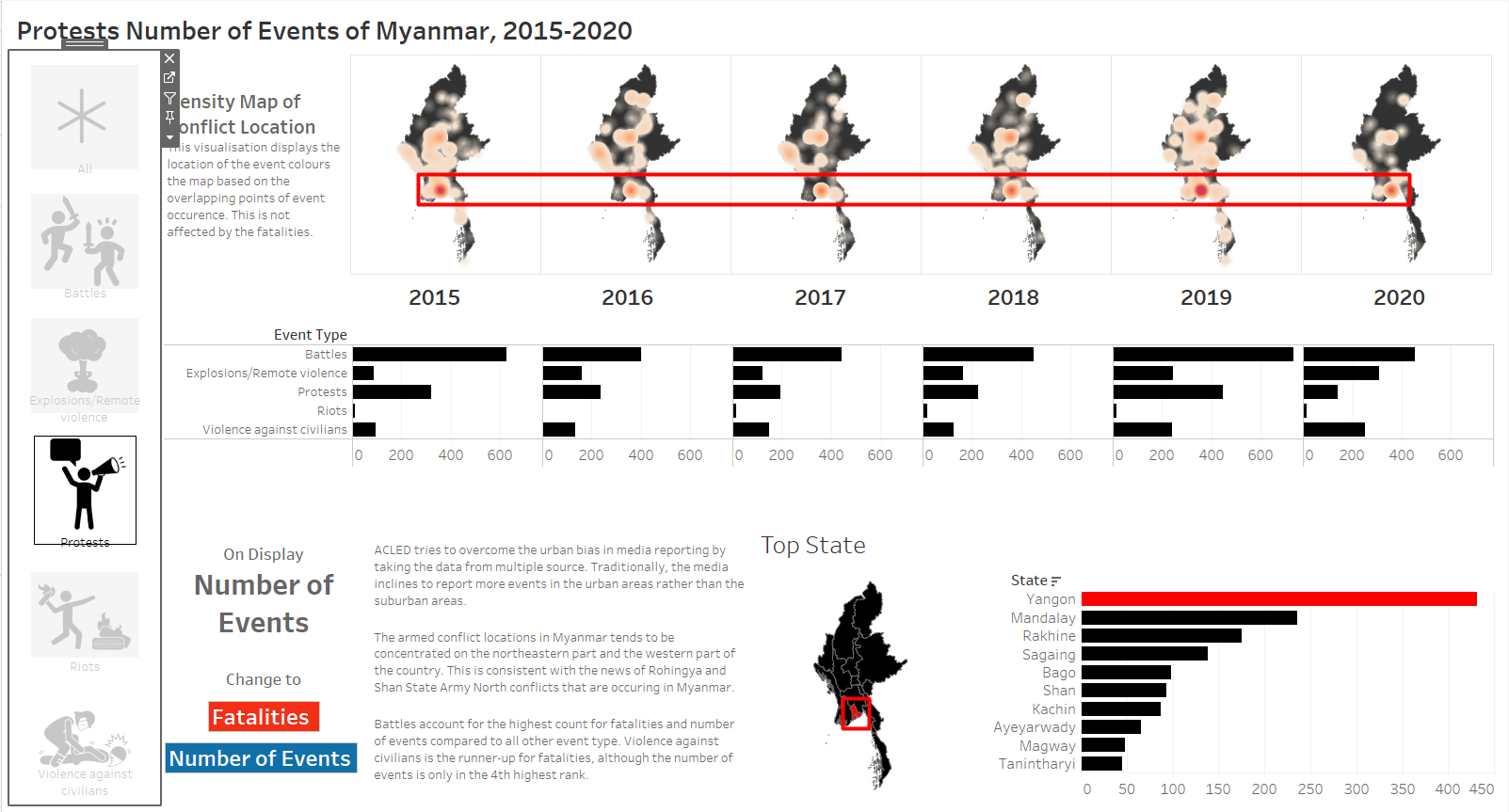
Even though Yangon is no longer the capital city of Myanmar since 2005, people still protests the most in Yangon. Some analysts believed that the move of capital city is motivated by the desire to shield the military from people’s protests, as Yangon is highly populated. If this analysis is true, the strategy seems to be working.
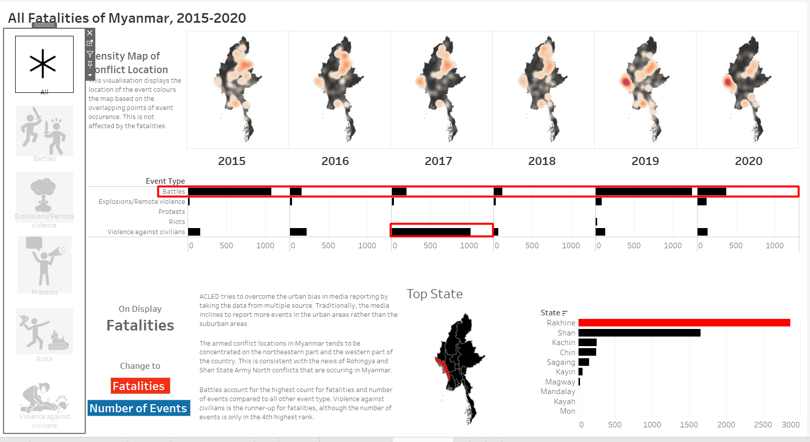
c. The violence against civilians in Rakhine is the lowest in 2018
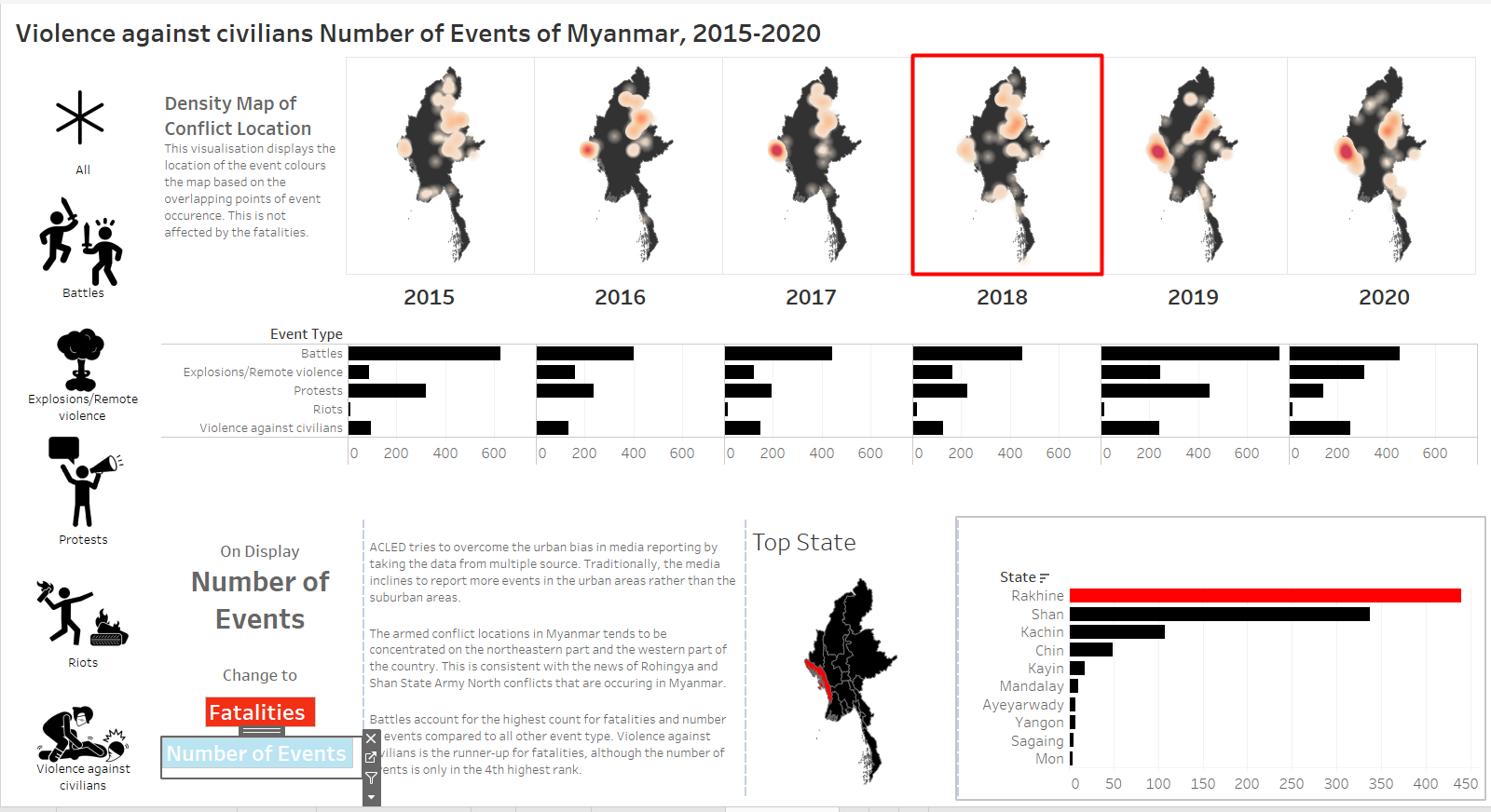
After the vast publication of Rohingya crisis in 2017, the density of violence against civilians decreases in 2018 before picking up again in 2019. This shows that media publication and protests actually helps to deter people from performing injustice, although it might be only temporary. This shows ignorance is very dangerous.
d. A conflict is rarely a one-off event, it may take years to resolve
For battles, explosions, and violence against civilians, we can see that the hotspots never disappears suddenly. It will continue to exist the subsequent years, although it may fade gradually. Riot is an exception because the number is too low, so the points in the map are individual location of a riot event. This shows that the process of conflict resolution must be pursued consistently and patiently, even when the progress seem to be close to none.
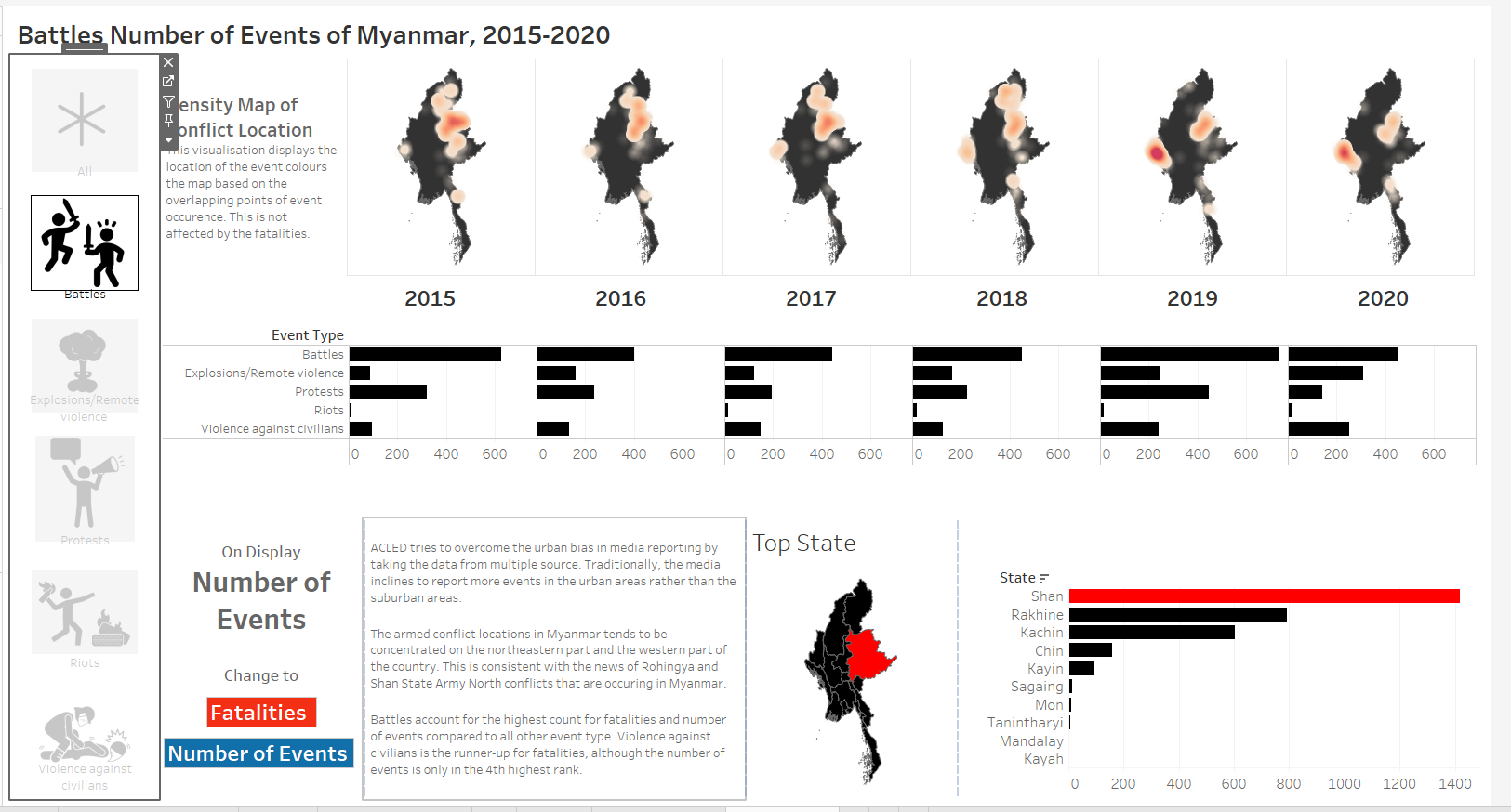
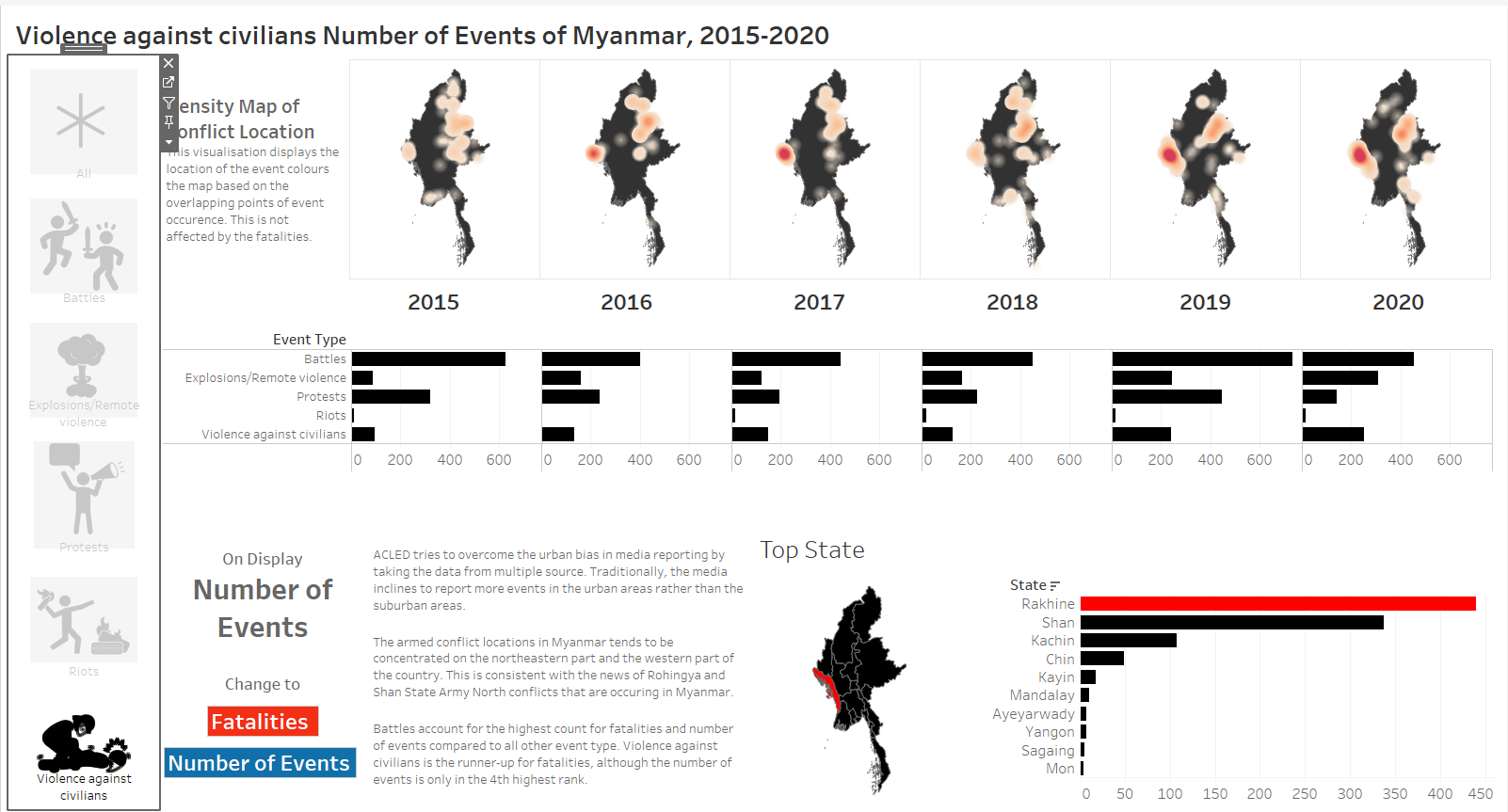
e. Battles account for the highest number of fatalities and number of events
Battle has the highest number of events and the highest number of fatalities. Violence has the second highest number of fatalities, even though the number of events ranks 4th. This is due to the spike of fatalities caused by violence against civilians in 2017. Battles is very costly, and therefore we should strive to maintain peace.